Tag Archives: Painting

Inspired to create by a very lovely client…

8 May

I have often wondered if I could break down my processes of creating to help those who say they aren’t creative be able to find their creative power. Maybe it is possible, but sometimes for me it is an elusive process. I rarely approach creating the same way every time. While Inspiration is a huge factor in creating, it is only one part of the process.

I can know in my head exactly what I want to create but if the timing isn’t right or I’m not in the right mindset it is often hard to put on paper & get it out of my head to a presentable medium. I recently had an amazing opportunity to create something bigger than I ever dreamed of creating. Believe me; I have a lot of big ideas & dreams when it comes to creating products designed by my own hands.

This though really pushed the limits of what I ever dreamed I could do. In fact, I probably never would have considered ever putting myself in this position if it weren’t for my very lovely client Lynette. Over a year ago Lynette hired me to help her & her husband create their dream home. I did not know at the time what a blessing this would be. There were many challenges along the way but I did my best to try to capture their vision & stay focused on making it a reality. I am very grateful for the opportunity to be able to do what I do best for these very deserving clients.

I did a lot of designing & collaborating with other talented folks throughout the process of designing the home. I created everything from custom fireplaces to elegant decorative finish work. I plan to write about some of those designs as well, but anyone who follows me knows my writing can end up on the back-burner somewhat.

If you follow me on instagram you may have already seen this project or the decorative library ceiling I painted. It isn’t typical for me to do work like this for my clients. Because of my background in art I am perfectly capable, but it is time consuming & stressful & as many artists know unless you are compensated for your time it isn’t always worth it. The turret ceiling took this to a whole other level by being so much more time & work than I anticipated. I knew though that I just had to plug through it & make it happen. I am lucky that I had the support I did, so I could get it done. I am so thankful for that.

I really started the process of designing it months before it came about. There was so much to do to move the house forward & there were many changes & additions. Every now & then she would say, “it would be nice to do something with that ceiling up in the turret.” I would agree with her, but we did not yet know what we were working with until the finish carpenter had completed his part of the installation.

I had grown to enjoy my client & her family so much. I was obsessed with making sure her home fit all her expectations. This is their dream home after all. She was a gem through every little problem that would come up in the building process. I also knew that when you start designing a high end home & putting high quality products into it, that nothing can ruin it more than having some element that is unfinished or non-related that somehow randomly sits in the midst of the design. I saw that the entry turret despite all its beautiful finish work was not going to look right without a little something more.
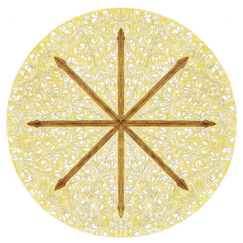
Design concept for Dashner Turret Design owned by April Elizabeth of A E DesignThere was so much to do but in the meantime on my downtime, I would try to sketch out options & ideas, at first I was hitting a designer’s block of sorts. I would continue to doodle knowing that even when I am not feeling it, sometimes I will have one little element that seems to lead somewhere.

I keep all my little sketch books for this reason. Sometimes I am doodling designs without a purpose but they are great & I am thinking how can I apply this to something? When I am struggling I go back thorough all the books & try to find elements that I can work with. It is rare that I sketch out a design perfect right off the bat. Sometimes It takes a lot of attempts to get things going in the right direction. This was probably one of the hardest designs to come up with. It took me a lot of time thinking & sketching it out.

I am extremely sensitive to my environment so sometimes my inability to create is because of surrounding distractions & then sometimes I am even fighting with little nagging subconscious fears that I won’t be capable of getting it right. I hold myself to very high expectations & when I am designing something I have never done before…it can be a small internal battle. I have learned a few tricks to deal with this though. I know the end result shocks everyone who has seen it including myself, but I wouldn’t want anyone to make the mistake of thinking it was a smooth process.
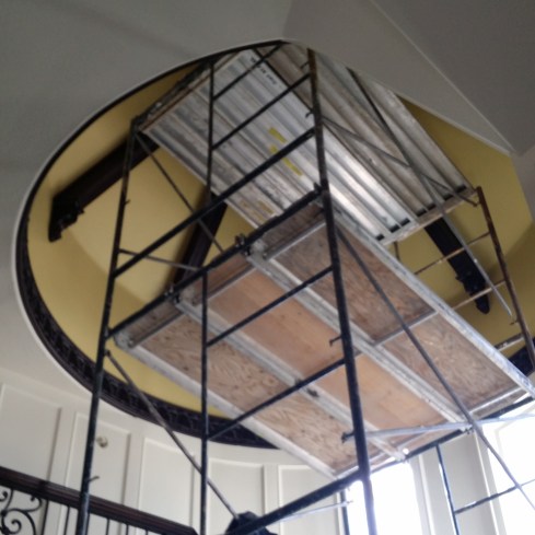
Up on the scaffold for AE Design Dashner Turret DesignGetting up on scaffolding when you are afraid of heights really makes you face your demons. I had experienced it a few months before when I painted the library ceiling. This was much higher & more difficult to reach. I am lucky I had a helper though. Still I have never experienced something that pushed me to the edge quite so much…the closest thing I have ever had to this feeling was when I was getting my interior design degree & pulling all nighters to get my presentations ready. I was a mom back then as well so I wore as many hats as I do now.
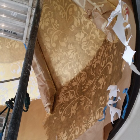
Moving Forward with the Dashner Turret Design by April Elizabeth of AE DesignTruth be told I would do it again. Maybe I wouldn’t have so many demons to fight off now. I found that being up high in a precarious situation made me feel vulnerable & like I didn’t have much control. I would run into trouble when I would find out the walls weren’t even or the template that was made for me wasn’t accurate. Things would take longer than I wished, then at night I would have to go home to modify or re-cut my reverse templates.It was an all consuming project that took over 100 hours. After I hit that marker I stopped keeping track.

The reason I would do it again? I have figured out through trial & error what works best but most importantly, It was a labor of love. I put a lot of my heart into it. There is something so powerful about creating something beautiful that always drives me to push through any discomfort that comes up, just so the finished result can come to life.

Honestly it is a good representation of how life can be. Things don’t always go well or the way to you plan. Sometimes you are wondering how this will ever work out. There are bumps in the road but if you keep persevering & keep your eye focused on the end result you can make things beautiful.

Dashner Turret Design lit up by the Chandy Design by April Elizabeth of AE DesignWhen I was up there I thought about their family & how many years of enjoyment they were looking forward to in their new home. I imagined their daughter someday standing on the stairs getting her pictures taken for prom or the boys walking up the stairs to their rooms after a long day of sports & activities. It is beautiful enough they could have a wedding in this home.

Even if they forget their designer down the road after all the work is done, I hope that somehow the love & respect I have for them will radiate from my work for years to come. I don’t know how it couldn’t. I left a little of my heart behind when I was painting.
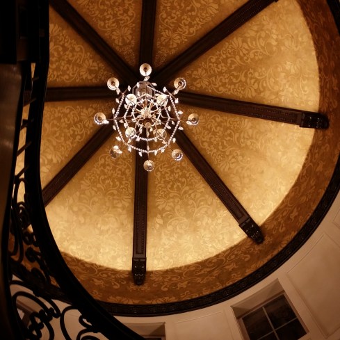
Dashner Turret from below  Design by April Elizabeth of AE DesignMy daily goal is to fill the world around me with beauty & love…that to me is what it means to be lovely.

Inspired to create by a sweet-as-candy-heart-shaped necklace…

26 Feb

So is it just me or has 2013 been moving at the speed of light so far? Okay. It isn’t really moving that fast…some days feel like they are dragging, but when I look back & realize we are ending the second month of this New Year I am thinking where did all the time go?

Although I haven’t blogged here for a while I can assure you I haven’t taken a break from my creating…I have just been juggling a lot of balls & honestly it is naturally easier to just create…writing about it though…well that isn’t always as easy.

So to give you a bit of perspective on what has had me so distracted besides my design business & the business of being a single mother…I do have to insert here that one of the highlights of the month was my daughter getting her pointe shoes. A big distraction & a moment of motherly pride over took me for a moment there, so I had to mention it…it happens sometimes.

I am still writing for the examiner online as the Salt Lake Interior Design Examiner. I recently covered a whole lot of information on some of 2013’s color trends & forecasts which you can check out here.

Then a somewhat newish adventure  for me has been working part-time  at Jcp’s (JcPenny’s) in the home & drapery department….which admit I am totally enjoying. I love the store, my managers & the associates there. I think it is a great fit right now for this Interior Designer. If you need blinds, shutters, drapes, bedding & or towels you should check them out. Product is great & pricing is amazing. We also just added a whole bunch of new products & lines in these departments…with even more to come including  Happy Chic by one of my favorite designers Jonathan Adler.

Now one of the reasons I mention this is because I have to give Jcp credit for the inspiration for this recent “Inspired to create by…” project. Just before February Jcp brought in a line of lab created gems & jewelry for Valentines. There were so many gorgeous choices & even though I try so hard to avoid the jewelry department I couldn’t avoid its sirens call when I saw this pretty ruby & white sapphire gem in their ad campaign, plus I have a huge weakness for pavé gem settings.

Lab Created Ruby from Jcp 2013

Admittedly since I was young I’ve had an aversion for heart-shaped anything…especially jewelry…I also couldn’t stand it when little girls would dot their i’s with little hearts…I must have held some kind of negative belief about them for some reason…but that is between me & my therapist…No. I don’t really have a therapist unless you are talking about Dr. Organic Dark Chocolate…

In the last few years symbolism has become very intriguing to me & I am using it quite often in my design work, so maybe that is the reason that despite any of my usual reasoning  & avoidance of things attached to the word cute…I fell head over heels in love with hearts this past Valentines, as well as a newly heightened passion for lace glitter…all of those beautiful romantic symbols of love.

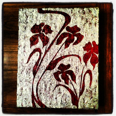
So from this jewel my little Valentines Moxie painting was born. I already had a prepared canvas with layers of red paint glitter, glass gems & acrylic resin. It was originally for something else that didn’t end up happening. When I realized looking into its depth was akin to looking into that tempting heart-shaped ruby in the jewelry case at Jcp, I suddenly knew that I wanted to accent this red canvas with shimmering, glimmering frosted white like that of white sapphires or sparkling snow.

Azure Elizabeth Design Valentines Moxie

Since flowers are often a part of Valentine’s Day I wanted them to be the theme of the piece. I used my stylized Moxie flowers that have adorned a few of my other paintings. I love curving, bold, extreme, yet feminine lines & a bit of whiplash curve every now & again. The moxie paintings reflect that bit of mania.

So here you go…my February creation inspired by a sweet as candy heart-shaped necklace that not only caught my eye but shot its little cupids arrow right into my heart & seduced me into buying it. Yes! I totally caved. Valentines gifts you get for yourself are really the best though. I highly recommend making this day every year a day of spoiling yourself & others instead of always relying on someone else to make it happen.

Inspired to create a little Valentines Moxie by a Lab created ruby by Jcp

Show a little love for yourself today & also have a lovely day!

PS. For more photos of this & other paintings please visit my Etsy shop AzureElizabethDesign

Xoxo’s

Inspired to create by…the perfect paisley, and the elements fire and water

19 Dec

For those of you who know me well you know that I juggle a lot of balls…though the truth is that because of my juggling act, very few people know me well enough to actually realize that. I confess…I am an extremely private person who only gives small glimpses out to others about my person which are usually based on content, subject matter and need. If there is no need then there is very little divulged leaving others to make assumptions about me, which they often do…I admit this can be quite interesting at times…

Can I get any more confusing? Yes! I guarantee I can.

Astrologically speaking I am dominantly Air and Fire with one sneaky little water sign planet, Scorpio…My Sun sign is in Libra. Yes, that is where my vanity comes from as well as my desire for romance and my love of beauty. On Twitter I refer to myself as A Lovely Designer…to understand why I use Azure as my alter ego go here…I use the word ‘lovely’ symbolically because if represents a combination of the two ideals, love and beauty that I equally value and try to create in life.

Love is emotional and beauty is visual, often stimulated by physical or environmental influences but at times they merge together into one. If I ever tell you to have a ‘lovely’ day I am wishing you actual love and beauty to be manifest in your life.  To me it is as positive an emotion as wishing you much happiness.

If  I tell you something or someone is “lovely” I am saying that to me it/they are of more value to me that just the superficial  appearance and that the worth and value runs much deeper with me.  This word is used in reference to people I value and love and the things they create. If I can see them or their heart in their creations there is nothing more lovely to me.

Now back to my astrological chart…I know you are just dying to know more…alright whatever! Indulge me please, I promise it will make sense shortly. I am more on topic than you think and this is an only round about apology for not posting more often.

So where were we….oh, yes…so my Moon is in Gemini, and this is where the importance for communication comes in. I am a communicator and nothing annoys me more than people thinking I can read their mind…I may be intuitive but I wont give you the pleasure of knowing what I read. It is not my responsibility, so If you don’t tell me something please don’t expect me to know about it. I am so not a busy body either…but we will get sidetracked if we go there…I also don’t take words, commitments and promises lightly so if you can’t walk your talk there will be probably little trust between us…unless it is something trivial that I don’t depend on to function.

I give the Air signs the credit for my being a bit of a free spirit…one who is attracted more to movement than being stagnant who moves quickly from one idea to the next. The free spirit comes in handy as an artist and designer and it allows me to be open-minded but it can mean I live very much in my head and will often put logic over my own heart and sometimes block myself from my emotions…something I am learning to recognize and be more careful about.

Now to top that all off I have two planets in Leo, one in Venus and one is Saturn. Darn it! I have not yet figured out how to allow my inner Leo’s out of their cage because Saturn is standing on my tail. Saturn, will always repress, suppress or oppress the planet it is in.

So how is this relevant to my Inspired to Create blog? Well, taking what I have learned about my own self from astrology, and seeing my strengths and where I am out of balance…I have used this understanding with the assistance of my Astrologist David Porter to design and create an environment for one of my clients. It is still a work in progress but until we addressed his astrological chart we just weren’t making any progress.

DSCN1584

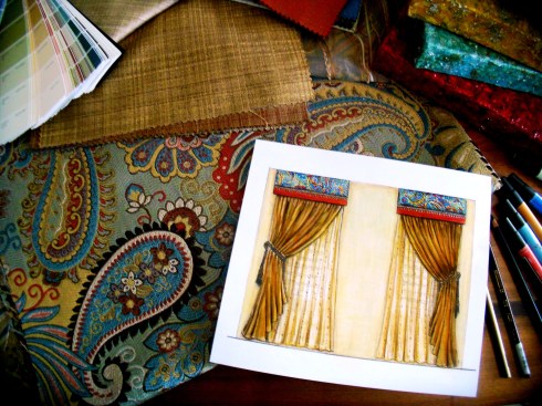
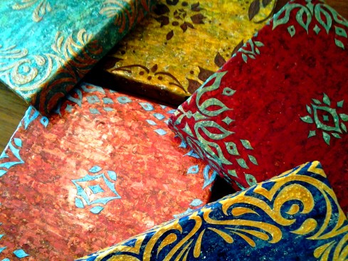
My clients astrological chart is an almost split down the middle with only Earth and Air planets. This means that the emotion that is represented by the Water planets and the passion of the Fire planets was somewhat void in his life…which he admitted too. This process spoke to him and when I suggested that we bring in colors and patterns to symbolize his missing elements it resonated with him. Then I found the perfect paisley fabric to honor all of the elements with reds and oranges to represent the missing fire and blues and greens for his water. Earth is represented by earth tones and air by the color yellow.

Designed and Painted for Lehi Client by A E Design Side View

I love using symbolism in my designs when I can. It is like turning your environment into a vision board so to speak and what better way to reach your subconscious than that?

Designed and Painted for Lehi Client by A E Design representing air earth and water

So here are a few glimpses of what we are using in the space as well as some custom art work I created for it. He was very patient with me since my gypsy like spirit means I can sometimes have a lot of irons in the fire.

Designed and Painted for Lehi Client by A E Design the whole collection

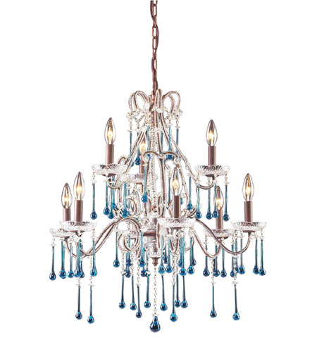
And here is the light that will be going over the kitchen table in a few weeks. I couldn’t help but give you a sneak peek.

4013_6+3AQ

Save

Inspired to create a ten foot mural by a mountain lake fishing trip…

7 Aug

Perhaps I am too ambitious. It is one thing to be in a constant creative mode, moving through life at an intense designing pace & quite another to sit down & write about it all…just so I can keep my audience on the edge of their seat…or at least remembering my name.

I recently finished a big project designing a wedding dress…which you can check it out here. It was awesome & I am very proud of how it turned out. Since then I have been on a roll & have sketched out a whole assortment  of designs for a wedding dress collection that I would love to introduce…someday maybe.

I am of course still writing for the online examiner as the Salt Lake City Interior Design Examiner & loving it! So if anything was to blame in my not keeping up with my blog, it would probably be….well, we just won’t be pointing fingers.

The fact is I am not super woman. If I was I would’ve flown by my own power to Vegas last Wednesday, when my flight to meet up with designing friend Brandon Smith at Vegas Market was delayed by four hours.

The truth is more often than not, after a long day of working I often can’t put more than two sentences together.  I am lucky if I am speaking coherently enough that my children hear, “it is time for bed” instead of that Charlie Brown adult gibberish.

I am really starting to think that is why they don’t respond…I must be speaking another language, either that or it is because I am the mother of two very ADHD teens. Life is never dull but it is one ride I do enjoy.

At this point I won’t promise to be more a more consistent writer. I refuse to subject myself to any kind of trivial guilt anymore. I am a “go with the flow” kind of gal who is more creative & productive the less negative pressure there is attached to things.

I am one designing woman who must put priorities first, which for me are my children & bringing home the bacon. After that the rest is just the frosting on the cake or pancakes & maple syrup on the plate…cake doesn’t really go with bacon.

With that being said I have a lot of things in the works & even nearing completion. Paintings, design work…I may even begin another wedding dress…you know, the usual. I do promise to keep you updated… at some point. I do!

In the meantime I am pulling from the archives (deep within my external hard drive) for this inspired to create post, which is based on a ten foot long mural I painted around 2005 for a little boy’s room in Draper Utah.

The family was a group of avid campers. They loved the outdoors & spending time together more than anything. They just said they wanted an outdoor scene for their oldest sons room so I pulled from my own stash of photos from a mountain lake fishing trip when my son was five years old.

It is a good thing I am addicted to taking ridiculous amounts of photos of my surroundings, because I had over ten views to use as my reference for the design.

East wall concept

I measured the room & did elevations to lay it out. The truth is this was my first mural. Art & painting I had done plenty off but mural work…not at all.

South wall concept

As with any design client, it was important to me that they knew what they were getting into before I even put paint to the walls. I believe concepts can help reduce anxiety about any designing or creative process. It puts your client at ease & helps them see that you know what you are doing by giving them a tangible piece of information about the project. Since people don’t read minds nor can they see what is in your head, I believe it is vital especially when someone is investing large amounts of money in something you have essentially dreamed up.

West wall concept

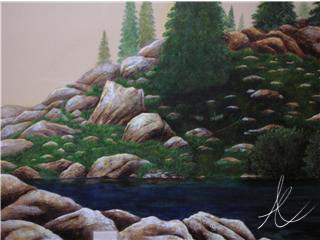
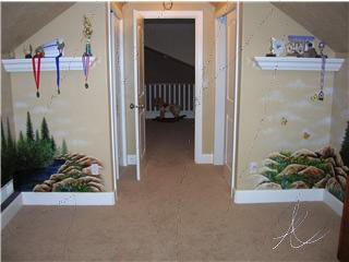
Here is the finished product. I don’t even remember how long it took me to complete (I’ve blocked it out) but it was a really busy time in my life so I was only able to squeeze in a few hours, a few days a week.

East Wall

I don’t typically paint murals & that is probably more my fault than anything. I have very strong opinions about murals which I’m sure has offended people at times but since this is my blog though I will not hold back…

East wall up close

In my opinion…there are very few places a mural is even appropriate.

I think restaurants & children’s spaces are the best places…if it actually adds to the design & doesn’t subtract. I have seen murals work in everything from historical homes, pediatric offices, hospitals & even arcades.

South wall mural

In my opinion…only ten…umm…maybe I will be more generous, twenty percent of murals I have seen, I like. I guess I have this snobby idea that they have to be classy & original. They shouldn’t look rushed, cheap or slapped on. The whole idea of faux painting a bookcases on your wall instead of just having one really baffles me. Although there are times adding an illusion through a mural works, but only in certain circumstances.

West Wall

Really the reason I don’t do more of them, is that people always want Disney characters on their child’s wall or Thomas the train. I myself hate having my copyrighted work stolen so I am not a fan of copying on that level. The other thing is that children grow very fast, so you date & condemn a room that may have been a juvenile haven at age three only to have it become a cartoon nightmare a few years later when the child is too embarrassed to bring their friends over or they don’t like that ‘subject’ anymore.

West wall up close

Being that I appreciate originality & longevity, if you were at ask me to paint Cinderella in your daughter’s room walls I would paint my own version of Cinderella, not Disney’s. One that she could head into her teenage years with. As for Thomas the train, wouldn’t you much rather have a classic old-fashioned Steam Locomotive or a sleek Modern high-speed rail train? Something that’s a  combination of fantasy with  a punch of realism  so you can grow up alongside it for a while?

Yep! That is what I thought.

Inspired to Create by…Scot Meacham Wood

22 Mar

My first introduction to Scot Meacham Wood was through twitter. His profile  said “plotting world domination, one decorative pillow at a time” & I knew he was someone I just had to follow.

Here is a little more about Scot…borrowed from his press kit…

Scot Meacham Wood, owner of his eponymous design firm based in San Fransisco, finds absolute delight seeing his client’s homes and lives transformed over the course of each design project. “People always seem to invite me into their lives right at that particular point of personal evolution. So it is often about so much more than floor plans and custom furniture. Interior Design changes the way people live.” After working with Ralph Lauren for 15 years, Scot opened his own design business in 2001-and has since worked on residential and commercial projects of all sizes, both here in the San Francisco Bay Area as well as homes across the United States. Runner, Musician, Anglophile, Textile junkie, Science fiction nerd, and Interior Designer, Scot Meacham Wood.

As you can see, Scot is very multidimensional. Talented, dashing, debonair & charismatic….I have never even meet him in person but it isn’t hard to get a feel of what he is about by looking at his work & through our online interactions. He is the author of one of my favorite blogs Tartanscot and has an amazing portfolio just brimming with incredible work. You should take  a moment and look through it. His designs are versatile yet all are soaked in comfort and perfect bliss. I can’t think of one room I have seen of his that hasn’t made me wish I could transport myself there with a good book & a dog to lay at my feet.

His rich traditional styling is my favorite of his work, decadent at times, always eclectic & dynamic. His inspires me often in so many ways. But Scot’s love of plaid has inspired me the most. If you follow this blog you know that I believe creation is triggered and inspired by others &  the world around us, but that true creation does not include directly translating the work of another. I also believe that inspiration is part of a grand learning process in which we often have to open our eyes to things we have forgotten or even discarded and see them in a new light.

I am guilty of doing this over the years. It is important as a designer & artist  to be open-minded as well as make a practice of looking at the world through the eyes of another.

Plaid for me, up until the last year was a reminder of the mid 90’s in Utah Valley where everyone was wearing plaid flannel shirts…including myself. There was so much of it & not always in the best color combinations that I was done with it, & fast… although I have two shirts that I think on now that I wish I had saved to make throw pillows out of…

Over a year ago around Christmas Rue magazine published an article showcasing Scot’s home at Christmas time called “Plaid is the new Black.” I was entranced. First of all the showroom in Salt Lake that I frequent does not have plaids such as these…he knows where to find all the good stuff…his taste is impeccable & he marries textures as well as prints together in genius ways that will allow the plaid to be the focal point, but to also fit comfortably in the environment as if it has been there forever. Look on page 238 for the article.

There is nothing I love more than seeing a designers personal taste & style come out in their work. We are all so diverse  so it is hard not to get excited by another designers interpretation of  environment.  Since that day I have been much more comfortable with this traditional pattern as well as embraced its possibility’s…

Oh, he also has these chairs in his home in the most incredible plaid I have ever seen…to die for color story. I literally have dreams about them…

So the question is how did I take this inspiring designers work & translate into a new creation…? Well, I may have been overly ambitious. Once I get an idea in my head, that is it. I have to try it out. Here is my inspired by Scot Meacham Wood’s love of plaid, painting.

This is a technique I have been working on for a few years…I have not seen it done by anyone else, but it doesn’t mean it hasn’t been…I have not shown anyone other than those close to me the collection where I have used this technique but to represent Scot’s rich traditional style, I felt this is the direction I had to go. Everything here is acrylic paint built up in layers. The plaid is built layer by layer then filled with an acrylic resin so you can actually look into the layers of the painting. The floral itself is also layers of paint & gel mediums.

This is very time-consuming process but like I said, once I get an idea to do something…well there you go.

I hope you take the time to get to know my friend Scot a little. A true gentleman & also a very good sport for letting me do this. Thank you so much Scot.

Inspired to Create by…Saint Patty’s Day!

18 Mar

It has been a busy last few weeks for this designer. It has been such a whirlwind I am not even quite sure when I posted last. There are some big changes in the air & the biggest one that has taken much of my focus has been my new gig writing for the online examiner as the Salt Lake Interior Design Examiner…my official title. As much as they want local content, design is design…so I have made it a point to make sure my articles are informative for anyone who wants to get inside my extremely complex designers head…scared or intrigued? No really, it is not as bad as it may sound & I think it is worth checking out.

St. Patty’s Day is coming to an end & first let me just clarify why I call it this, lest you assume I just enjoy a bit of sacrilege…which I do. I am fully aware that it is called Saint Patrick’s Day but this day is even more meaningful to me than a day to dye your beverages green & wear the color of grass from head to toe. Today, March 17th is my mothers Birthday. Now don’t go asking which one because she has never confessed her age to me & since I was never the child to snoop through the house trying to find gifts & hidden secrets, I have just left it at that. If I really need to know I can find out.

Since her middle name is Patricia I often will call it Saint Patricia’s’ Day (truly she is one) but you would all be seriously confused….& sure I was disturbed (which isn’t impossible). There is also that little dilemma that my exes name is Patrick. You understand now right?

These past two days I’ve restlessly needed a break from my writing & at the spur of the I moment came up with two ideas for a couple of little paintings. I have been intrigued with the idea of using seasonal or themed paintings & art work for decorating with during the holidays. I had two little canvases that were already prepped with green textured paint that I had set aside. All of the sudden I decided, quite at the last-minute to put all my focus into them & transform them into something wonderfully lucky. Here are the results. May you all find rainbows with gold at each end & may the grass always be green on your side of the pasture. May the Luck of the Irish be with you my dears!

Image

Inspired to Create by…Pratt & Lambert’s Chinese Orange

25 Feb

No matter how much I love color or how long I have worked with it, I find that much like my relationships with others there can be a bit of an ebb & flow as to how much they are in my life at the moment. You probably know what I mean. You have friends who move away, live in another city, run away, get married, take work transfers, or even the adventuring types who won’t stay tied down to anywhere for very long…you get the idea.

Then there are the friends who you haven’t talked to since high school or college, but  one day through a phone call or a visit & your relationship is strengthened & revived. Once someone is a true friend they always are, even when life just gets in the way at times.

Well I fall in & out of love with color almost the same. It isn’t that I ever stop loving colors really, I love all colors (just like I love all my friends) it just depends on how the colors are applied or in my life at the moment.

Sometimes certain colors are less in the forefront of my thoughts than others might be. I think much of this is due to the seasonal & yearly trends as well as my clients needs & the trends of the geographic area or the demographics I’m working with.So with that being said, it can be understandable that I am often excited about  old colors that have become new again. It is much like becoming re-acquainted with a  childhood friend. Right now the colors I am renewing a relationship  with are apricots, peach’s, tangerines & corals. Four colors I hadn’t seen much of until about a year ago when they started popping up in textiles & design work everywhere. These new/old colors went from being nostalgic reminders of my youth…to being all grown up with all newer versions of themselves, that are now being cleverly used in vibrant, rich, elegant spaces. So in a way I would say as well as being reunited with some old friends, I have also made some new ones. I’ve been so inspired by these warm tones that the end of last summer 2011, I begin playing with the idea of using them in a set of stylized paintings that I had sketched out as a concept, but hadn’t yet decided what color direction to take. I started looking to various inspirations. I love the tangerines & apricots blending into cool pinks tiptoeing into the territory of the color coral such as the photo of the table setting above that I spotted on Pinterest the other day. Coral itself can be more complicated. There are coral pinks & coral reds with many tones & shades in-between. These are vibrant, sensual colors. I love them all equally & in trying to decided what direction to take, I desired to find a color to base my work off of that bridged the gap between both the pink & the red.

That is when I found Chinese Orange from Pratt & Lambert paints. Deep enough to lean towards the red direction of coral, but pink enough to be sultry & hot. The photo above shows the original texture & color blending of my canvas before the design was added, along with some inspirational photos to reflect the colors I used.I love the contrast of cool colors against warm colors because these opposites enhance one  another. I wanted the design to stand out so that was how I decided on the abstracted floral’s textural color. This raised design is a combination of textural paint mediums including  mica flakes suspended in acrylic polymer. The surface of the canvas had to be smooth to apply the top layer of pattern, so I used transparent gel acrylic which gives it depth so you can look right through it & see the dimension.

The truth is this was all very experimental on my part. I had used these various mediums a few years before for some commissioned art work & knew that I was only scraping the surface of these products potential. I wanted to do more.

The idea here was to create art work that had some flexibility…I have my logo/initials embedded subtly in the acrylic resin in such a way that you can hang these four pieces in any combination you wish & not see it unless you were up close. This set is the only one of hundreds of thumbnails with similar concepts. At some point I plan to take my designs into my own textile line.

As an interior designer, I realized I could not just create the art without envisioning the space  or color story it would belong in. I decided to give Olioboard some of my time & see what kind of concepts I could come up with. This  mood board creator program has so many possibilities. These are all merely concepts, but hopefully they will help you envision some of the possibilities of  these new paintings ‘Coral Blooms.’

Blue, turquoise, tangerine & coral tones. This color story reminds me of a cottage by the sea. It can’t take itself too seriously when vibrant corals with hints of copper & orange (a touch of tangerine tango, Pantones 2012’s color of the year) are juxtaposed against a powdery blue & vivid turquoise.I love the dynamic contrast of  monochromatic neutrals such as whites, blacks & grays with a pop of color to spice things up. If you love bright colors, but the idea of painting them all over your walls, or using them in your furniture  terrifies you, then using a neutral based palette & implementing color into your decor & a few key accent furniture pieces is a lovely compromise. I truly believe every space has the potential for showcasing the colors you love most, even if it seems they may be too dominate & daring to work with. This is where utilizing the experience & expertise of a professional designer can come in handy.

This set of paintings was intentionally created toward a more feminine direction, which depending on how they are hung will emphasis that quality more or less. I rarely get to do rooms with a more  feminine appeal with my actual clients…unless you would  consider my eleven year old daughter a client which I do, but she may not. The trademark of a more feminine feeling space is often in its use of color, although there are many other design elements that can create that more feminine feeling, such as the lines of the furnishings & accessories…I think the mood board above illustrates what I am talking about.

I love mirrored furniture for its lightness, It can be fresh, light & glamorous but it can also be used to create dynamic & dramatic contrast in a space…that is a different mood board & blog post though though. Periwinkle & I have had a bit of a strained relationship I will admit. I mentioned it in my other blog a few months back. It isn’t that I dislike this color it just is so much better company in an environment where others can feel included…such as the vivacious Chinese Orange & the subtle but charming silver.

Have a wonderful weekend everyone!

Inspired to Create by…the Vivacious Meredith Heron

11 Feb

Inspired to create by…the Vivacious Meredith Heron

I meet the beautiful & vivacious Meredith Heron on twitter a little over a year ago. Have you ever looked back at a time in your life & thought “okay…I guess that was a blessing in disguise?”

Well this was the case with my meeting Meredith. I had been extremely ill for a straight two months (November through December) with what seemed like everything one after the other, viruses, infections then ending in severe bronchitis…possibly walking pneumonia. I was running high fevers & delirious for much of that time & slept a lot. I could not work nor take care of my children who spent much of that time (being that it was their holiday vacation) with their dad.

When I thought was going to go lose my mind from lying around & in between bouts of delirium I would get online & try to accomplish something. The big goal was to learn twitter. I had been on twitter for some time but really had not figured out the ropes. So very different from the facebook I knew so well.

That is where  found Meredith Heron. I was following numerous designers all over the world & was watching how they interacted. It was the highlight of my day, soaking up the beauty & creativity of their work & blogs  as well as hearing what designing was like on their end of the globe.

I first spotted Meredith when she was to be a guest on twitters #DesignTV weekly Chat. Hosted by Amy Beth Cupp Dragoo & Jonathan Legate. I saw the inviting tweet & opened the link to see the picture of a Stunning Redhead, Meredith Heron who is well-known for being a regularly featured guest/host & design expert on national television programs such as Restaurant Makeover through HGTV Canada.

I was of course intrigued so I looked through her info & decided to follow her.  It was less than a week later when I was tweeting with a few folks getting my “wings wet” so to speak (still learning how to tweet back & forth) that she posted something or other about her very young adorable son & motherhood. I, feeling like an expert on the subject for some reason or other (possibly because I have been there done that ) replied to one of her tweets not expecting any kind of acknowledgement & fell off my chair when she replied…

So that is how it began. For those of you who are still twitt-errified of tweeting I am telling you that you are missing out. My world is much more interesting & colorful because I have folks like Meredith who are a part of it now.

Yes, yes! To many this online-social-media-network thing seems impersonal & much like smoke & mirrors & I wont disagree that it can be. There is always good & bad you just have to separate the two & not worry  much about what is going on behind the screen. Oh, & also know when to block someone.

Now that you know the background of how I meet Meredith  & began passively stalking her (which I’m sure I never would have been if she had not acknowledged me the way she did) you will understand why she is a constant source of inspiration to me.

She is an incredible designer & very real. I love that she speaks her mind & tells it like it is. She has more Moxie than anyone I know, which might be the red hair (I was married to a redhead but he didn’t even have close the kind of fire she possesses). I have only so much time to support & follow others. I do wish there was more of me & my time to spread out…because it is thin at times, but I do my best to support those who I know appreciate it & if I can slip some kind of support to someone who doesn’t really care, I still will.

This I can promise, will not be the first time Meredith is mentioned in this blog. Because of her genius with color (colour for those in the UK) design, & her impeccable good taste she is constantly causing the synapses to jolt in my brain with inspiration.

To me being inspired as I call it, which for me becomes a response & desire to create, is a form of receiving ideas & messages that are not a direct interpretation of the actual source of the inspiration. I am also a firm believer in giving credit where it is due. As small as it may seem if something someone does or something I see triggers a creative idea or response, I am grateful for it. Nothing is really small if it can have some impact on others.

As simple as it may seem the outfit that Meredith is wearing in the above photo during Blogfest 2011…struck me on various levels. I saw that turquoise bracelet with the deep magenta/fuchsia top & was stunned at how fabulous she looked & how beautifully she stood out in the crowd. I myself cannot pull off wearing this much color (not without the makeup of a drag queen anyway). This is the benefit of being a vivacious redhead I believe.  As much as I play with & love color I had never thought to combine the color of natural turquoise (my favorite color for the moment) with such a vibrant red violet.

It was this very photo that inspired my somewhat experimental paintings of Turquoise & Magenta-Moxie which I have listed right now on Etsy.

I used to paint/draw stylized realism, but over the past few years my artistic expression has become very loose & adventurous. This color combo was initially inspired by the outfit Meredith wore in the above picture. I added the symbolism with the animal print because to me it represents, independence, drive, boldness, tenacity…basically “Moxie” which Meredith actually helped me realize I was visually trying to define after the fact, but couldn’t put a name to.

It is difficult for me to show through photos how these really look. They are a combination of layers of acrylics & clear gel acrylic resins that create a dimension you can look into & through. I have also created them in a way that you can hang them as you please to create any form or pattern desired as shown here. My signature symbol fairly subtle for this reason.

They were created for a small space & although I have many ideas as to what color combinations they could be used in I have only had the time to throw one mood board together using a new/old favorite Olioboard. A great tool for presenting concepts that I have vowed to get back into using thanks to Leslie Carothers. I may have to add more of these ideas later since I cannot help myself & I have two other drafts in the works…

%d bloggers like this: