Archive | Interior Design RSS feed for this section

Inspired to create by a sweet-as-candy-heart-shaped necklace…

26 Feb

So is it just me or has 2013 been moving at the speed of light so far? Okay. It isn’t really moving that fast…some days feel like they are dragging, but when I look back & realize we are ending the second month of this New Year I am thinking where did all the time go?

Although I haven’t blogged here for a while I can assure you I haven’t taken a break from my creating…I have just been juggling a lot of balls & honestly it is naturally easier to just create…writing about it though…well that isn’t always as easy.

So to give you a bit of perspective on what has had me so distracted besides my design business & the business of being a single mother…I do have to insert here that one of the highlights of the month was my daughter getting her pointe shoes. A big distraction & a moment of motherly pride over took me for a moment there, so I had to mention it…it happens sometimes.

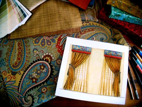
I am still writing for the examiner online as the Salt Lake Interior Design Examiner. I recently covered a whole lot of information on some of 2013’s color trends & forecasts which you can check out here.

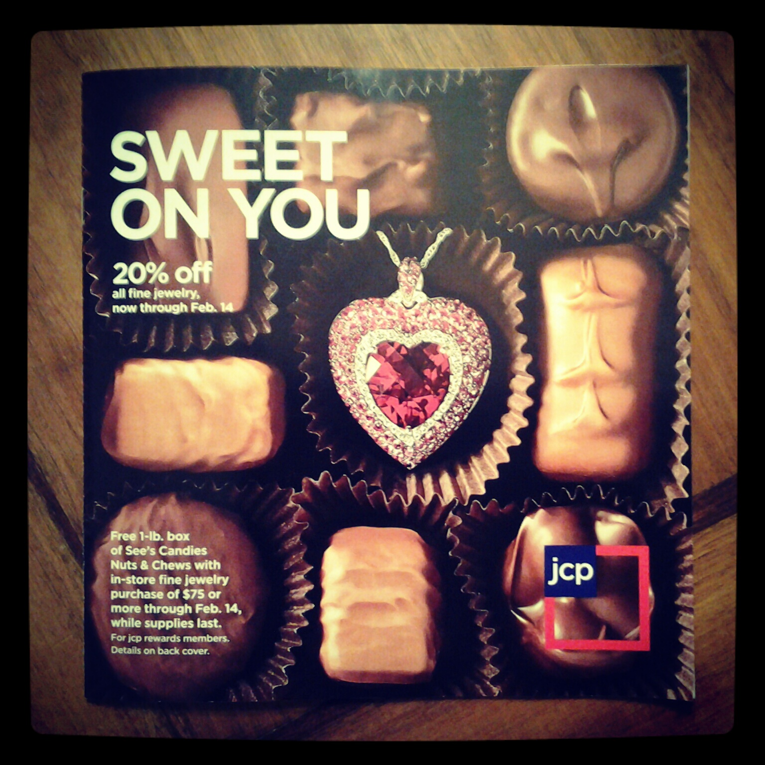
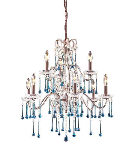
Then a somewhat newish adventure  for me has been working part-time  at Jcp’s (JcPenny’s) in the home & drapery department….which admit I am totally enjoying. I love the store, my managers & the associates there. I think it is a great fit right now for this Interior Designer. If you need blinds, shutters, drapes, bedding & or towels you should check them out. Product is great & pricing is amazing. We also just added a whole bunch of new products & lines in these departments…with even more to come including  Happy Chic by one of my favorite designers Jonathan Adler.

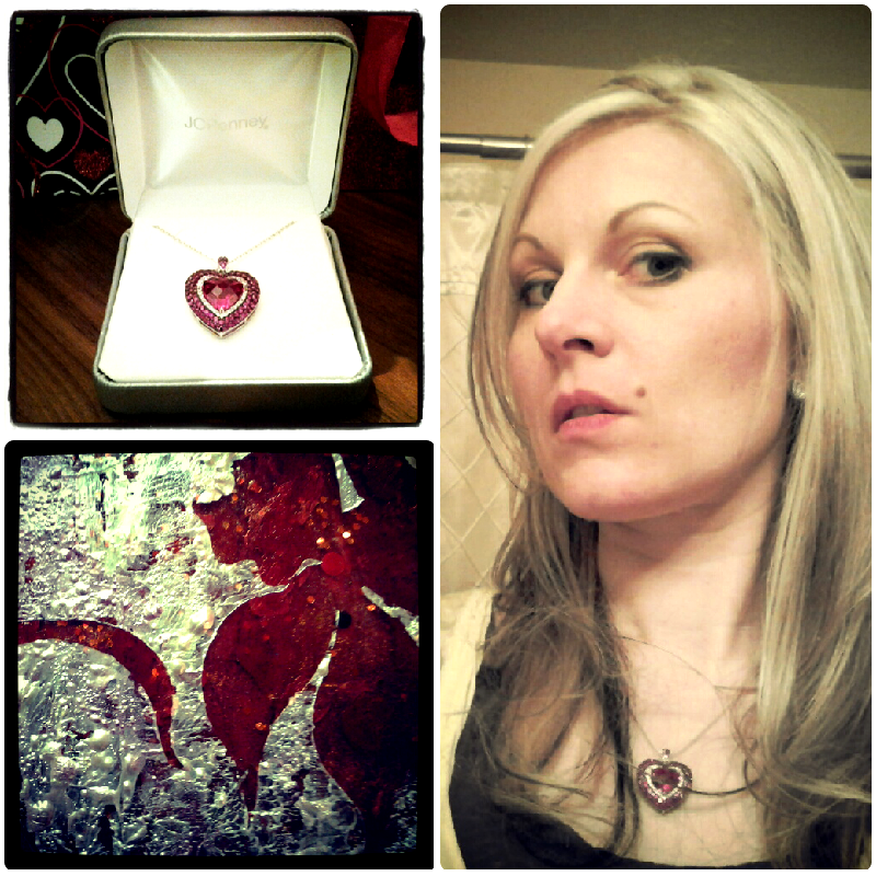
Now one of the reasons I mention this is because I have to give Jcp credit for the inspiration for this recent “Inspired to create by…” project. Just before February Jcp brought in a line of lab created gems & jewelry for Valentines. There were so many gorgeous choices & even though I try so hard to avoid the jewelry department I couldn’t avoid its sirens call when I saw this pretty ruby & white sapphire gem in their ad campaign, plus I have a huge weakness for pavé gem settings.

Lab Created Ruby from Jcp 2013

Admittedly since I was young I’ve had an aversion for heart-shaped anything…especially jewelry…I also couldn’t stand it when little girls would dot their i’s with little hearts…I must have held some kind of negative belief about them for some reason…but that is between me & my therapist…No. I don’t really have a therapist unless you are talking about Dr. Organic Dark Chocolate…

In the last few years symbolism has become very intriguing to me & I am using it quite often in my design work, so maybe that is the reason that despite any of my usual reasoning  & avoidance of things attached to the word cute…I fell head over heels in love with hearts this past Valentines, as well as a newly heightened passion for lace glitter…all of those beautiful romantic symbols of love.

So from this jewel my little Valentines Moxie painting was born. I already had a prepared canvas with layers of red paint glitter, glass gems & acrylic resin. It was originally for something else that didn’t end up happening. When I realized looking into its depth was akin to looking into that tempting heart-shaped ruby in the jewelry case at Jcp, I suddenly knew that I wanted to accent this red canvas with shimmering, glimmering frosted white like that of white sapphires or sparkling snow.

Azure Elizabeth Design Valentines Moxie

Since flowers are often a part of Valentine’s Day I wanted them to be the theme of the piece. I used my stylized Moxie flowers that have adorned a few of my other paintings. I love curving, bold, extreme, yet feminine lines & a bit of whiplash curve every now & again. The moxie paintings reflect that bit of mania.

So here you go…my February creation inspired by a sweet as candy heart-shaped necklace that not only caught my eye but shot its little cupids arrow right into my heart & seduced me into buying it. Yes! I totally caved. Valentines gifts you get for yourself are really the best though. I highly recommend making this day every year a day of spoiling yourself & others instead of always relying on someone else to make it happen.

Inspired to create a little Valentines Moxie by a Lab created ruby by Jcp

Show a little love for yourself today & also have a lovely day!

PS. For more photos of this & other paintings please visit my Etsy shop AzureElizabethDesign

Xoxo’s

Inspired to create by…the perfect paisley, and the elements fire and water

19 Dec

For those of you who know me well you know that I juggle a lot of balls…though the truth is that because of my juggling act, very few people know me well enough to actually realize that. I confess…I am an extremely private person who only gives small glimpses out to others about my person which are usually based on content, subject matter and need. If there is no need then there is very little divulged leaving others to make assumptions about me, which they often do…I admit this can be quite interesting at times…

Can I get any more confusing? Yes! I guarantee I can.

Astrologically speaking I am dominantly Air and Fire with one sneaky little water sign planet, Scorpio…My Sun sign is in Libra. Yes, that is where my vanity comes from as well as my desire for romance and my love of beauty. On Twitter I refer to myself as A Lovely Designer…to understand why I use Azure as my alter ego go here…I use the word ‘lovely’ symbolically because if represents a combination of the two ideals, love and beauty that I equally value and try to create in life.

Love is emotional and beauty is visual, often stimulated by physical or environmental influences but at times they merge together into one. If I ever tell you to have a ‘lovely’ day I am wishing you actual love and beauty to be manifest in your life.  To me it is as positive an emotion as wishing you much happiness.

If  I tell you something or someone is “lovely” I am saying that to me it/they are of more value to me that just the superficial  appearance and that the worth and value runs much deeper with me.  This word is used in reference to people I value and love and the things they create. If I can see them or their heart in their creations there is nothing more lovely to me.

Now back to my astrological chart…I know you are just dying to know more…alright whatever! Indulge me please, I promise it will make sense shortly. I am more on topic than you think and this is an only round about apology for not posting more often.

So where were we….oh, yes…so my Moon is in Gemini, and this is where the importance for communication comes in. I am a communicator and nothing annoys me more than people thinking I can read their mind…I may be intuitive but I wont give you the pleasure of knowing what I read. It is not my responsibility, so If you don’t tell me something please don’t expect me to know about it. I am so not a busy body either…but we will get sidetracked if we go there…I also don’t take words, commitments and promises lightly so if you can’t walk your talk there will be probably little trust between us…unless it is something trivial that I don’t depend on to function.

I give the Air signs the credit for my being a bit of a free spirit…one who is attracted more to movement than being stagnant who moves quickly from one idea to the next. The free spirit comes in handy as an artist and designer and it allows me to be open-minded but it can mean I live very much in my head and will often put logic over my own heart and sometimes block myself from my emotions…something I am learning to recognize and be more careful about.

Now to top that all off I have two planets in Leo, one in Venus and one is Saturn. Darn it! I have not yet figured out how to allow my inner Leo’s out of their cage because Saturn is standing on my tail. Saturn, will always repress, suppress or oppress the planet it is in.

So how is this relevant to my Inspired to Create blog? Well, taking what I have learned about my own self from astrology, and seeing my strengths and where I am out of balance…I have used this understanding with the assistance of my Astrologist David Porter to design and create an environment for one of my clients. It is still a work in progress but until we addressed his astrological chart we just weren’t making any progress.

DSCN1584

My clients astrological chart is an almost split down the middle with only Earth and Air planets. This means that the emotion that is represented by the Water planets and the passion of the Fire planets was somewhat void in his life…which he admitted too. This process spoke to him and when I suggested that we bring in colors and patterns to symbolize his missing elements it resonated with him. Then I found the perfect paisley fabric to honor all of the elements with reds and oranges to represent the missing fire and blues and greens for his water. Earth is represented by earth tones and air by the color yellow.

Designed and Painted for Lehi Client by A E Design Side View

I love using symbolism in my designs when I can. It is like turning your environment into a vision board so to speak and what better way to reach your subconscious than that?

Designed and Painted for Lehi Client by A E Design representing air earth and water

So here are a few glimpses of what we are using in the space as well as some custom art work I created for it. He was very patient with me since my gypsy like spirit means I can sometimes have a lot of irons in the fire.

Designed and Painted for Lehi Client by A E Design the whole collection

And here is the light that will be going over the kitchen table in a few weeks. I couldn’t help but give you a sneak peek.

4013_6+3AQ

Save

Inspired to create by…my mother and her indigo eyes

12 Sep

I have to start this post out by saying I love my mother. I love her dearly lest I seem impersonal as I continue to write….I am just going with the flow on this one so who knows how it will come out.

You see when it comes to design I am all business. This, I am afraid has not made working with other woman always easy…this is not in reference to my mother so please don’t misunderstand. After all these years, if there is a woman I can work well with, it would be my mother. I do sometimes have to remind her when she asks for my honest opinion and she didn’t like it, that she did ask.

If I gave out awards for the best female client of the year…which I’ve actually considered doing…for this year 2012, it would be my mother.

A mother daughter relationship can be very complicated at times and I would be lying if I didn’t say that ours been evolving and ever-changing over the years.

I am no longer a five-year old little girl sitting on the floor near my mothers feet as she sews at her sewing machine while I carefully practiced my hand stitching, passing it to her for inspection periodically.  I am also not the young preteen who years later as I was beginning  to sew my own clothing, would scream up the stairs for her in sheer panic when I sewed the wrong side of something together. The thought of un-picking made me hysterical and I did a lot of it back then.

She was my first teacher and the person whom I give credit…or the blame for my initial addiction to creating (maybe this is why she is so supportive where others haven’t been).

The tables have turned a little bit since that time, and with this last project I became the teacher. I forget sometimes is that the  things that have become second nature to me are really quite intimidating to others.

Everything is a domino effect. It all started with my mother’s bathroom cabinet. It was shabby, dark and worn and with it only having one door it was an organizational nightmare. She was tired of opening it and having everything fall out or having it all packed in so tightly she had to dig to find the toilet bowl cleaner. It probably doesn’t help that as a hair dresser she has perm rods, scissors, various razors and such she needs to store.

So she asked me if I thought there was a better option. Truth be told it would be tight, but a raised height vanity with two banks of drawers on each side, and one door in the center was the best we could do. It took some convincing my cabinet guy, who knew the drawers would have to stay pretty small.

It would also have to be custom-made. You cannot buy a box like that in the needed dimensions pre-made. I pointed out to her that if she was going to put a fresh brand spanking new cabinet in she might want to update the floor…which was a worn vinyl that she just happened to adore. Blue is her favorite color so I have to tread lightly when it comes to anything blue.

She was not thrilled but she was respectful and decided to humor me and go look at tile options….the one I recommended from Daltile was lovely enough that she forgot all about her blue vinyl flowers.

She knew that she wanted the cabinet to be lighter and she already had the wall paint…which she had bought three years ago, and no I wasn’t with her. We were suddenly working around this previous selection so we knew any direction we went had to make the blue paint work.

For the countertop I suggested she go with a granite and an undermount sink. As you can see the cultured marble top had seen better days.

She was concerned because she wanted a blue countertop and knew that isn’t so common in natural stone… I suggested the blue pearl with the hopes of grounding the brighter blue in her paint.

I would consider its color to be a deep indigo tone. It is actually the color I think of when I think of my mother, so I was actually dying to show it to her.

You know that old Peter Murphy song ‘Indigo eyes?’ I have no idea what all the lyrics say, but I have always loved the chorus. Well, I used to think it was about my mother because she really does have indigo eyes, which genes she has generously transferred through me to my blue-eyed daughter.

The color potential of this granite was never more apparent though, than when we found the perfect wall tile for her backsplash. I knew it was her when I saw it, even though Daltile had so many other amazing options for us to choose from..when you know, you just know.

This really was a small job, but it was no small thing having the bathroom unusable for two and half weeks. It can make even the most patient of people edgy and irritable but she handled it with grace. Tonight we discussed it and now that all the dust has settled and she has organized it all, she is wondering how she lived in it the way it was before.

She is happy with it, which is music to my ears.

The guys who did the work were so incredible and are always my go to guys when I have the choice. For the tile work we worked with Joe from K J Tile. The granite was done by Gene Prunty of Medusa Granite and Marble. The best place to go “when you turn to stone.” The Cabinet was a collaboration between friend, and fellow designer David Porter and was  built by Bear River Cabinetry.

My thanks goes out to them for always coming through for me. Much gratitude and appreciation to these gentlemen and all the others who were involved in making my mothers indigo eyes sparkle.

Inspired to create by…Blue Abalone…

17 Jun

Now typically I am not one for feeling guilty about this sort of thing but the fact that I haven’t posted since Easter is really getting under my skin. This I promise you is not due to being in a slump or any kind of designing funk. Quite the opposite really…I have been busy as usual, but just my normal sort of busy.

What this means is that I have great inspired projects in the works that I cannot wait to share with you…they just aren’t ready yet. Here is a hint, there is some art on the easel, so to speak & even some clothing design in production….a ‘Wedding Dress’ actually. I wasn’t planning to give you that much info, but if you are reading this little blog of mine here, you deserve more than just my gratitude. Thank you for reading & please stay tuned for what is coming.

One thing I must also mention is my somewhat recent gig with the online Examiner. Yes, I am writing as the Salt Lake Interior Design Examiner (my official title) & I love it. I will admit as with anything that implementing this into my life has meant some juggling at times…but it is all worth it.

So in the meantime I am pulling out a little inspiration from the archives. This one has been on my mind of late as I am seeing all the home product catalogs highlighting summer by the sea themes.

Image

These renderings are from a college assignment. We were to design a Cape Cod beach house with very specific spatial requirements. It was probably the most time consuming plan I did in college but the most enjoyable.

ImageRather than use the typical beachy color schemes or even a nautical inspiration, I chose my palette from the beautiful subtle periwinkle or blue tones that can be found in Abalone shells. There is something sort of mysterious about the sea & the pearly undersides of textural seas shells & sea creature are a lovely representation of its hidden treasures to me.

Image

I love to mix what was then (2004) considered to be more unexpected textures together…it wouldn’t be so unusual now I am sure. My fabrics were combinations of luxurious silks for pillows & drapery, with nubby linens for the bed & upholstery, natural stone counter-tops & flooring in earth tones, while the soft floor coverings & window treatments were woven organic materials. I specified lighter woods, simple contemporary lines in the furniture rather than the more traditional items you might see in a home by the sea.

ImageHere are my concepts for the design, I had to recreate the boards somewhat…I  can see a few things I would go back & change in my renderings but experience always does that. I hope you enjoy!

Inspired to Create by…Scot Meacham Wood

22 Mar

My first introduction to Scot Meacham Wood was through twitter. His profile  said “plotting world domination, one decorative pillow at a time” & I knew he was someone I just had to follow.

Here is a little more about Scot…borrowed from his press kit…

Scot Meacham Wood, owner of his eponymous design firm based in San Fransisco, finds absolute delight seeing his client’s homes and lives transformed over the course of each design project. “People always seem to invite me into their lives right at that particular point of personal evolution. So it is often about so much more than floor plans and custom furniture. Interior Design changes the way people live.” After working with Ralph Lauren for 15 years, Scot opened his own design business in 2001-and has since worked on residential and commercial projects of all sizes, both here in the San Francisco Bay Area as well as homes across the United States. Runner, Musician, Anglophile, Textile junkie, Science fiction nerd, and Interior Designer, Scot Meacham Wood.

As you can see, Scot is very multidimensional. Talented, dashing, debonair & charismatic….I have never even meet him in person but it isn’t hard to get a feel of what he is about by looking at his work & through our online interactions. He is the author of one of my favorite blogs Tartanscot and has an amazing portfolio just brimming with incredible work. You should take  a moment and look through it. His designs are versatile yet all are soaked in comfort and perfect bliss. I can’t think of one room I have seen of his that hasn’t made me wish I could transport myself there with a good book & a dog to lay at my feet.

His rich traditional styling is my favorite of his work, decadent at times, always eclectic & dynamic. His inspires me often in so many ways. But Scot’s love of plaid has inspired me the most. If you follow this blog you know that I believe creation is triggered and inspired by others &  the world around us, but that true creation does not include directly translating the work of another. I also believe that inspiration is part of a grand learning process in which we often have to open our eyes to things we have forgotten or even discarded and see them in a new light.

I am guilty of doing this over the years. It is important as a designer & artist  to be open-minded as well as make a practice of looking at the world through the eyes of another.

Plaid for me, up until the last year was a reminder of the mid 90’s in Utah Valley where everyone was wearing plaid flannel shirts…including myself. There was so much of it & not always in the best color combinations that I was done with it, & fast… although I have two shirts that I think on now that I wish I had saved to make throw pillows out of…

Over a year ago around Christmas Rue magazine published an article showcasing Scot’s home at Christmas time called “Plaid is the new Black.” I was entranced. First of all the showroom in Salt Lake that I frequent does not have plaids such as these…he knows where to find all the good stuff…his taste is impeccable & he marries textures as well as prints together in genius ways that will allow the plaid to be the focal point, but to also fit comfortably in the environment as if it has been there forever. Look on page 238 for the article.

There is nothing I love more than seeing a designers personal taste & style come out in their work. We are all so diverse  so it is hard not to get excited by another designers interpretation of  environment.  Since that day I have been much more comfortable with this traditional pattern as well as embraced its possibility’s…

Oh, he also has these chairs in his home in the most incredible plaid I have ever seen…to die for color story. I literally have dreams about them…

So the question is how did I take this inspiring designers work & translate into a new creation…? Well, I may have been overly ambitious. Once I get an idea in my head, that is it. I have to try it out. Here is my inspired by Scot Meacham Wood’s love of plaid, painting.

This is a technique I have been working on for a few years…I have not seen it done by anyone else, but it doesn’t mean it hasn’t been…I have not shown anyone other than those close to me the collection where I have used this technique but to represent Scot’s rich traditional style, I felt this is the direction I had to go. Everything here is acrylic paint built up in layers. The plaid is built layer by layer then filled with an acrylic resin so you can actually look into the layers of the painting. The floral itself is also layers of paint & gel mediums.

This is very time-consuming process but like I said, once I get an idea to do something…well there you go.

I hope you take the time to get to know my friend Scot a little. A true gentleman & also a very good sport for letting me do this. Thank you so much Scot.

Inspired to Create by…Pratt & Lambert’s Chinese Orange

25 Feb

No matter how much I love color or how long I have worked with it, I find that much like my relationships with others there can be a bit of an ebb & flow as to how much they are in my life at the moment. You probably know what I mean. You have friends who move away, live in another city, run away, get married, take work transfers, or even the adventuring types who won’t stay tied down to anywhere for very long…you get the idea.

Then there are the friends who you haven’t talked to since high school or college, but  one day through a phone call or a visit & your relationship is strengthened & revived. Once someone is a true friend they always are, even when life just gets in the way at times.

Well I fall in & out of love with color almost the same. It isn’t that I ever stop loving colors really, I love all colors (just like I love all my friends) it just depends on how the colors are applied or in my life at the moment.

Sometimes certain colors are less in the forefront of my thoughts than others might be. I think much of this is due to the seasonal & yearly trends as well as my clients needs & the trends of the geographic area or the demographics I’m working with.So with that being said, it can be understandable that I am often excited about  old colors that have become new again. It is much like becoming re-acquainted with a  childhood friend. Right now the colors I am renewing a relationship  with are apricots, peach’s, tangerines & corals. Four colors I hadn’t seen much of until about a year ago when they started popping up in textiles & design work everywhere. These new/old colors went from being nostalgic reminders of my youth…to being all grown up with all newer versions of themselves, that are now being cleverly used in vibrant, rich, elegant spaces. So in a way I would say as well as being reunited with some old friends, I have also made some new ones. I’ve been so inspired by these warm tones that the end of last summer 2011, I begin playing with the idea of using them in a set of stylized paintings that I had sketched out as a concept, but hadn’t yet decided what color direction to take. I started looking to various inspirations. I love the tangerines & apricots blending into cool pinks tiptoeing into the territory of the color coral such as the photo of the table setting above that I spotted on Pinterest the other day. Coral itself can be more complicated. There are coral pinks & coral reds with many tones & shades in-between. These are vibrant, sensual colors. I love them all equally & in trying to decided what direction to take, I desired to find a color to base my work off of that bridged the gap between both the pink & the red.

That is when I found Chinese Orange from Pratt & Lambert paints. Deep enough to lean towards the red direction of coral, but pink enough to be sultry & hot. The photo above shows the original texture & color blending of my canvas before the design was added, along with some inspirational photos to reflect the colors I used.I love the contrast of cool colors against warm colors because these opposites enhance one  another. I wanted the design to stand out so that was how I decided on the abstracted floral’s textural color. This raised design is a combination of textural paint mediums including  mica flakes suspended in acrylic polymer. The surface of the canvas had to be smooth to apply the top layer of pattern, so I used transparent gel acrylic which gives it depth so you can look right through it & see the dimension.

The truth is this was all very experimental on my part. I had used these various mediums a few years before for some commissioned art work & knew that I was only scraping the surface of these products potential. I wanted to do more.

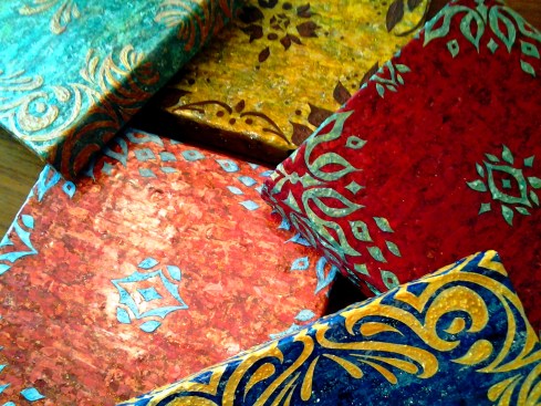
The idea here was to create art work that had some flexibility…I have my logo/initials embedded subtly in the acrylic resin in such a way that you can hang these four pieces in any combination you wish & not see it unless you were up close. This set is the only one of hundreds of thumbnails with similar concepts. At some point I plan to take my designs into my own textile line.

As an interior designer, I realized I could not just create the art without envisioning the space  or color story it would belong in. I decided to give Olioboard some of my time & see what kind of concepts I could come up with. This  mood board creator program has so many possibilities. These are all merely concepts, but hopefully they will help you envision some of the possibilities of  these new paintings ‘Coral Blooms.’

Blue, turquoise, tangerine & coral tones. This color story reminds me of a cottage by the sea. It can’t take itself too seriously when vibrant corals with hints of copper & orange (a touch of tangerine tango, Pantones 2012’s color of the year) are juxtaposed against a powdery blue & vivid turquoise.I love the dynamic contrast of  monochromatic neutrals such as whites, blacks & grays with a pop of color to spice things up. If you love bright colors, but the idea of painting them all over your walls, or using them in your furniture  terrifies you, then using a neutral based palette & implementing color into your decor & a few key accent furniture pieces is a lovely compromise. I truly believe every space has the potential for showcasing the colors you love most, even if it seems they may be too dominate & daring to work with. This is where utilizing the experience & expertise of a professional designer can come in handy.

This set of paintings was intentionally created toward a more feminine direction, which depending on how they are hung will emphasis that quality more or less. I rarely get to do rooms with a more  feminine appeal with my actual clients…unless you would  consider my eleven year old daughter a client which I do, but she may not. The trademark of a more feminine feeling space is often in its use of color, although there are many other design elements that can create that more feminine feeling, such as the lines of the furnishings & accessories…I think the mood board above illustrates what I am talking about.

I love mirrored furniture for its lightness, It can be fresh, light & glamorous but it can also be used to create dynamic & dramatic contrast in a space…that is a different mood board & blog post though though. Periwinkle & I have had a bit of a strained relationship I will admit. I mentioned it in my other blog a few months back. It isn’t that I dislike this color it just is so much better company in an environment where others can feel included…such as the vivacious Chinese Orange & the subtle but charming silver.

Have a wonderful weekend everyone!

Inspired to Create by…product packaging

3 Feb

So the best made plans often seem to go a bit awry…at least for me. Just as I started this new blog I began experiencing technical difficulty’s. The simplified version is that I lost my computer & a lot of files & data…kind of a set back to say the least.

So with that being said, it wasn’t really my plan that this ‘Inspired to Create by…product packaging’ become my second post, but with February, the month of so-called romance approaching…maybe  this slightly estrogen soaked post will be appreciated.

A few years back I had a beautiful home. My dream home, then & still (being that I still dream about that home). In this home I had a lovely master bath, bedroom & dressing area.

Even though I had the privilege of designing for many clients & filling their homes with beautiful furnishings, in my own home & as a single parent my budget was fairly limited. Despite these limitations I worked to create each space to be simple & functional as well as infusing as much beauty into it as possible.

In my closet/dressing area I had beautiful eastern light in the morning to do my makeup. Which if you know me you know this is an important part of my daily ritual. The vanity area I kept fairly monochromatic so as to not compete with my colorful clothing…all in color order of course…oh & my shoes as well… This was my space. My retreat & I loved it.

I had future plans to add a center island with drawers to expand the storage space, as well as a small upholstered bench & I also had room for a folding screen…I just hadn’t found “the one” yet…this room was really not complete but it was a luxury for me just the same.

What did I say earlier? Something about the best laid plans…

Maybe if so many American’s were not experiencing this I would not even admit it, but I am part of the first wave of homeowners who lost their homes in 2009.

All of the sudden I find my children & I in a “temporary” living situation  where I am having to share a room with my nine year old daughter. I went from having a beautiful sun soaked house to being a renter & a basement dweller.

Good designers know how to work within limitations. I admit I paused on doing anything at first in our shared space, because it was supposed to be “temporary”. At least I really wanted to believe it was.  It was however our place of retreat from the outside world & I knew it needed to be emotionally fulfilling on some level. Waking up in a sparse, ugly, dimly lit room (my things were mainly in storage still)  was & is, no way to start the day.

My dilemma however was, how do I take my decor which was dominantly in shades of silver sage with a dark Mahogany bed & dresser & mix it with the vibrant decor of an almost ten year old girl? Then one day I found it. Right after the Christmas Holiday on the clearance shelf at Walgreen’s.

Bottles & tubes of lotion all decked out in a stylized floral of creams, pink, silvers & sea-foam green. Colors that were all grounded with a touch of black…making the soft pastels seem a tad more mature. This surprisingly  appealed to me, & I knew that this was going to be my starting point for creating a harmonious space for the two of us, without my having to give up the  adult decor.

I have struggled with a love hate relationship with pink over the years…but as an accent & with other colors …I can deal.  On the vanity is where our two separate areas meet as one. The pink I used there was a colder pink, with a touch of orchid.   It all became a bit more fussy than I was used to in my home, but the space needed lots of color & light. Mirrors to reflect the light were essential so I added one on top on the desk (it really is a desk from Ballard Design)  as well as one against the wall.

On my daughter’s bed I incorporated hot pink, teal, black & white pillows on a deeper silver sage green & cream print duvet…. I had a huge assortment of stuffed animals to work around.

My bedding for the most part stayed the same (no sense in buying new for a “temporary” space) with an addition of a pillow coordinating with the same tones of what was existing in my bedding with just a touch more pink.

I purchased two mirrored night stands because they reflected light & visually do not take up much space in a smaller area. I love sparkle & glamor of mirrored furniture as focal point pieces. I am against matching bedroom sets…

I never thought I would ever have pink in my room again. I thought the whole pink thing had ended when at eighteen & I covered over my pale pink walls in a forest green, gold & marbleized…very masculine wall paper. Yes! You guessed it. Late 80’s, early 90’s ish.

The truth is you never know when you will fall back in love with something you thought you were over, (like the color pink) or what little things might inspire you to go a whole new direction. Keep your eyes open. If something catches your eye, it can inspire you to create.

Inspired to Create by the Beauty’s of India…

12 Jan

This is my first official post on this new blog, other than my intro…so here goes!

A few years back I was brought into a new build project by a couple who had originally been working with another designer. The structure of the house was for the most part complete, but it was the finishing touches were what they were struggling with.

Building your new dream home is a huge endeavor.  I had assisted clients  in over 100 new builds at that point &  understood the anxiety they were experiencing to get it right & the need to know that it really was all going to come together beautifully. Both the husband & wife were brilliant Doctors from India, who were both some of the nicest clients I have ever worked with.

The need to visualize was great for them, along with a desire to make their home feel very personal & unique. They had worked hard for many years to get to the point where they could build their dream home, & when it comes to dream homes it is as much an emotional investment as it is a financial investment.

The floorplan itself was designed by Jeremy Gates of Salt City Home Designs. It was a grand entrance with a curving staircase & a large open area below which needed something….based off my other medallion designs we decided a medallion would be the perfect fit.

The home was to be furnished with an eclectic, elegant collection of the furnishings & art much of it from their  native home in India. To me it was vitality important that the medallion work harmoniously which these existing elements… So I began my research….

India had held an impression of romance for me as a young child. Part of this I believe was the story my mother had told me many times of the Taj Mahal. One year for Halloween I remember my mother painting my face brown, spraying my hair black & painting a red dot on my forehead, then wrapping me in a Sari & sending me off to the school parade. It was the itchiest costume I had ever worn, but I felt fascinating & exotic regardless….plus no one even recognized me not even my teacher. It was a good costume.

In my research I was inspired by the delicate, detailed ornamentation of the Indian culture.  From a brides henna tattooed hands  to the intricate  lacy fretwork or repetitive shapes in the architecture….to patterns of embroidered medallions on silk sari’s or embellished metals & gems.  I wanted my design to be reminiscent of these influences.

I came up with three different designs options for the medallion.  After the client selected the one they wanted, I then rendered  options for placement & for the sake of visualizing the colors of the materials & also as important  so they could decide on the direction & placement. Which I used to have an approximately 12′ diameter stone water-jet cut medallion fabricated.

Here is the finished result….

This design is owned & copyrighted by myself, April Elizabeth of A E Design. Any reproduction of use must be approved personally by me. Thank you.