Tag Archives: april elizabeth

Inspired to create by…an antique set of silverware

23 Jan

I am constantly inspired by nearly everything that comes my way whether via the web or my daily surroundings.

The only disadvantage to this is that I only have so much time in a day to act on ideas that will flood my mind. I am constantly leaving myself little scribbled sketches with what I hope will be just enough information about my vision, which I can hopefully discern for processing at a later time.
Yet it doesn’t always work that way. I can tell you looking at such scribbles a year later, even when they have color lists that were a big part of the idea with the intention of triggering the scene back into my recollection…the ideas are often lost.

It is difficult sometimes to resurrect these little creative surges & downloads. It probably doesn’t help that these creative blasts like to come during the most inopportune moments…such of those of deep exhaustion as I am lying in bed helplessly falling asleep.

You may ask what my point is? My point is this…I’m a constant creative magnet taking in more data than I can process into actual tangible results. My list of what I hope to paint, design & creates grows longer everyday even though my time to do it seems more limited. This however does not mean that I am not creating at all…quite the contrary. It means that my focus has become less of the things I want to do & more on what my clients needs are at the moment.

I have created some amazing designs in the past little while…some of which are top secret. Those that are not, rarely get much time in the spotlight as I quickly move on to the next task. Quite frankly I am suited to this sort of variety. There is nothing monotonous about my design business. I am just terrible at taking a moment to write about it & share.

That being said…a cross between apology & justification for not blogging in a while….I am going to share a creation that has been a while in the making.

Many of you who are close to me know I have been dating Craig for a long time… about five years ago his mother gave him some of her older furniture & antiques when she got re-married & moved away for a time.
One of these things was a set of silverware.

Not being a pro in the antique business. I’m not sure how to find the years, dates & values of things. All I know about this silverware is that it looks really old. I think it is stunning though. It fulfills all my beliefs about what old fashioned romantic silverware should be like (it is my Libra mentality to romanticize nearly everything).

Silverware from the Hewitt Family
Unfortunately the picture I have of it is not very flattering. Something about this designed medallion really struck me & I found the design fascinating.

In 2009 I was volunteered to refurbish some props for the Mountain West Ballet, Nutcracker performance. When it came to decorating the large presents that some of the dancers come out of, I decided that the only way to make it look like wrapping paper was to stencil them. It was difficult finding large enough stencils…so I resorted to creating my own using the silverware medallion as my inspiration.
It turned out so well that I never forgot the thought I had, that this pattern might look nice as a fabric pattern….

Vintage Bird Nutcracker Gift Boxes Designed by April Elizabeth for Mountain West Ballet
Back when I was very young, I had this dream. It was a big dream that carried me through my youth & teenage years. That was the desire to be a fashion designer. It may have been my exposure to sewing. I had been sewing since I was five years old…maybe it was the piles of old pattern design books I would track down at all the libraries & spend hours reading. Yes. That has to be it. The library…

I was driven to design clothes. Much of my teenage years I was self educating myself in such things.

It was this time spent, reading, studying, sewing, making my own patterns & clothes (otherwise I was limited to hand me downs) that taught me a great deal about textiles. Years later when I ended up on the path to an Interior Design degree, this knowledge came in handy because I knew them inside & out.

Knowledge is one thing, but I also loved textiles & fabric. I read everything I could on repeats & fabric design but so much of it was vague…almost protected information. It was hard to find much information & the tools to print, silk screen & paint my own fabric would be difficult to justify as a hobby.

Since that time I have wanted to have my own fabric line. Truthfully, every time I see a designer with their own fabric line I will pour over their bio to try to find out how they got started. Each line says so much about the designer’s personality as well as design style & I find it fascinating.

Duralee happens to be my favorite fabric companies to look at such designers, because they really put a lot of emphasis on their talents & lines. To private label with a company like Duralee…that would be the dream.

In researching fabric designers, I know there are people who specifically design fabric & do the artwork to help fulfill many a designers’ vision. For me being an artist before getting my Interior Design degree I decided it was time to challenge myself.

I needed an easy subject to start with so I defaulted to one I already had a myriad of sketches for. The bird medallion inspired by Craig’s antique silverware. Knowing that I could change the colors to any that I wanted later on, I made the decision not to invest in new paint. I painted it with what I already had & considered each color as a separator to each other.
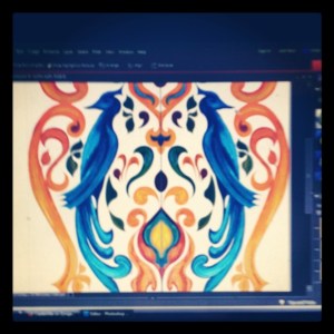
A E Design Original Scanned Design of Vintage Bird Medallion
Then I scanned it into my computer & began using Photoshop to clean it up. This was a long process since I had to work on it in bits & pieces as time allowed. Then I played around with various filters…
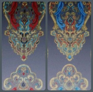
A E Design Playing with color for the Vintage Bird Design
Many color samples later & it was beginning to look really decent. Then the craziest thing happened….
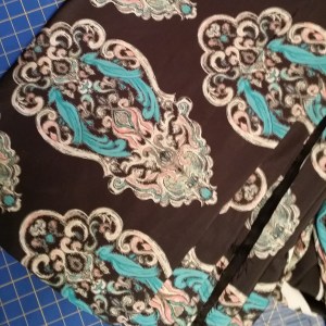
After looking for months for the perfect fabric for one of my clients…one with all the colors she wanted to bring into her home, I heard myself throw out the idea that “maybe I could design it?”

Well, she wanted to see what I had right away. She loved the design. It was transitional leaning into a traditional vibe, so the process of getting each fabric right began. It took time & weeks every time I would order a new color sample but finally we got it right.
IMG_20140621_092932
Then because she was ready to rock & roll…I used my sewing skills (which I had put in cold storage for a few years) & made eight back tab panels of 132” drapes, fully lined with blackout lining.

A E Design Sewing my custom fabric into drapes
I am really happy with the result & what I learned from this experience is invaluable. I may not be designing exquisite textiles for a high end designer fabric company, but I can design fabric. In fact I am planning to design a few things with my antique bird design & see how they sell online.

Azure Elizabeth Design Vintage Bird Fabric in Red & Gray A E Design

Azure Elizabeth Design Vintage Bird Fabric in Teal & Black A E Design The other thing I learned is that I need to have someone else do my sewing sometimes, just so I can keep myself moving forward & creating as well as get in some Z’s.

These particular color combinations were put together for my client. To see more of my colorways in this “Vintage Lovebird” pattern feel free to visit my spoonflower shop. Azure Elizabeth Design Vintage Bird Fabric in Redl & Gray
Inspired to create by…some hard boiled eggs…transforming them for the our Easter Celebration.

6 Apr

I could go on about how lovely Spring is & what an inspiring time of year it is to see new life, all the flowers coming up out of the ground & the blossoms on the trees. The truth is Spring has always been my favorite season, well right next to early Fall, but I woke up this morning  & it was almost 30 degrees & snow was everywhere. I was not the heavy kind, but the wet snow that sticks. It was quite a sight on all the neighbors white blossoming trees. Yes, I live in Utah where the weather is quite fickle so Spring & I are not speaking to one another right now.

It may have been the cold & the fact that I could not find my winter coat this morning as I walked, No! Ran out the door to meet with my accountant…Frankly I was not very inspired when I faced the day & was more irritable than usual…I am not a morning person by any stretch of the the imagination. Today I was sure when I woke up I was not even going to be a April 6th person, but four hours later this all changed.

Suddenly after weeks & weeks of extreme busyness trying to get ready to file my taxes & juggling my other responsibility’s I felt free! The children are on Spring break so we decided we might as well do our egg dying today. This got their cute little noses out of the books they were reading & gave us some time together.

I took one look at those white hard boiled eggs & suddenly I was feeling ambitious. We were at my mothers house so we set out the dye just the way I did as a child. We put garbage sacks on the table with layers of newspaper over the top & for the dye we put one tablespoon of vinegar in each cup with boiling water & more than a few drops of McCormick brand food coloring in each cup.

I put two layers of tape lined up next to each other about four wide, with each layer going the opposite direction to reinforce it on a piece of wax paper. I used blue painters tape on the bottom because it is easier to remove the wax paper off of than the Scotch tape which is firmer. Then I drew a design over it with a fine Micron marker & used fingernail scissors (my secret tool for cutting out fine detail & curves) to cut it out & then used the tip of an exacto knife to carefully remove the wax paper off the back. Now I had a way to transfer a design to the egg.

I put the egg  in yellow dye briefly so it would be a soft color underneath the tape. Then I let it dry completely before I applied the tape design, rubbing it softly to make sure it would not slip off. First I dipped the egg with the design in a warm green. After a bit I removed it & let it dry. Then I added a few more sticky stencils then I let it sit in the cooler almost jade green dye.

The fun thing about using the tape over the eggs is that  the dye will leak under it a bit…fairly randomly & when it does it gives the area  a sort of tie dyed look. We all got pretty creative here but I may have gone over board. Once I get an idea in my head I have to try it. That is why I have an animal print egg & a few abstract eggs to go alone with my floral designed eggs.

My children & I have  not spent this much time dying eggs in a very long while. It was nice to let our creative juices flow & just enjoy a project without feeling like we had to hurry to move on to the next thing.  For me doing this kind of casual design that is for no one but myself is a great way to recharge my battery so I can tackle the bigger more serious design stuff. It is as good for me as meditation.

If you still haven’t dyed your Easter eggs yet & are looking for a way to mix it up a bit give this a try. I would love to know how they turn out. Happy Easter for all of you Easter celebrators!

Inspired to Create by…Saint Patty’s Day!

18 Mar

It has been a busy last few weeks for this designer. It has been such a whirlwind I am not even quite sure when I posted last. There are some big changes in the air & the biggest one that has taken much of my focus has been my new gig writing for the online examiner as the Salt Lake Interior Design Examiner…my official title. As much as they want local content, design is design…so I have made it a point to make sure my articles are informative for anyone who wants to get inside my extremely complex designers head…scared or intrigued? No really, it is not as bad as it may sound & I think it is worth checking out.

St. Patty’s Day is coming to an end & first let me just clarify why I call it this, lest you assume I just enjoy a bit of sacrilege…which I do. I am fully aware that it is called Saint Patrick’s Day but this day is even more meaningful to me than a day to dye your beverages green & wear the color of grass from head to toe. Today, March 17th is my mothers Birthday. Now don’t go asking which one because she has never confessed her age to me & since I was never the child to snoop through the house trying to find gifts & hidden secrets, I have just left it at that. If I really need to know I can find out.

Since her middle name is Patricia I often will call it Saint Patricia’s’ Day (truly she is one) but you would all be seriously confused….& sure I was disturbed (which isn’t impossible). There is also that little dilemma that my exes name is Patrick. You understand now right?

These past two days I’ve restlessly needed a break from my writing & at the spur of the I moment came up with two ideas for a couple of little paintings. I have been intrigued with the idea of using seasonal or themed paintings & art work for decorating with during the holidays. I had two little canvases that were already prepped with green textured paint that I had set aside. All of the sudden I decided, quite at the last-minute to put all my focus into them & transform them into something wonderfully lucky. Here are the results. May you all find rainbows with gold at each end & may the grass always be green on your side of the pasture. May the Luck of the Irish be with you my dears!

Image

Inspired to Create by…Pratt & Lambert’s Chinese Orange

25 Feb

No matter how much I love color or how long I have worked with it, I find that much like my relationships with others there can be a bit of an ebb & flow as to how much they are in my life at the moment. You probably know what I mean. You have friends who move away, live in another city, run away, get married, take work transfers, or even the adventuring types who won’t stay tied down to anywhere for very long…you get the idea.

Then there are the friends who you haven’t talked to since high school or college, but  one day through a phone call or a visit & your relationship is strengthened & revived. Once someone is a true friend they always are, even when life just gets in the way at times.

Well I fall in & out of love with color almost the same. It isn’t that I ever stop loving colors really, I love all colors (just like I love all my friends) it just depends on how the colors are applied or in my life at the moment.

Sometimes certain colors are less in the forefront of my thoughts than others might be. I think much of this is due to the seasonal & yearly trends as well as my clients needs & the trends of the geographic area or the demographics I’m working with.So with that being said, it can be understandable that I am often excited about  old colors that have become new again. It is much like becoming re-acquainted with a  childhood friend. Right now the colors I am renewing a relationship  with are apricots, peach’s, tangerines & corals. Four colors I hadn’t seen much of until about a year ago when they started popping up in textiles & design work everywhere. These new/old colors went from being nostalgic reminders of my youth…to being all grown up with all newer versions of themselves, that are now being cleverly used in vibrant, rich, elegant spaces. So in a way I would say as well as being reunited with some old friends, I have also made some new ones. I’ve been so inspired by these warm tones that the end of last summer 2011, I begin playing with the idea of using them in a set of stylized paintings that I had sketched out as a concept, but hadn’t yet decided what color direction to take. I started looking to various inspirations. I love the tangerines & apricots blending into cool pinks tiptoeing into the territory of the color coral such as the photo of the table setting above that I spotted on Pinterest the other day. Coral itself can be more complicated. There are coral pinks & coral reds with many tones & shades in-between. These are vibrant, sensual colors. I love them all equally & in trying to decided what direction to take, I desired to find a color to base my work off of that bridged the gap between both the pink & the red.

That is when I found Chinese Orange from Pratt & Lambert paints. Deep enough to lean towards the red direction of coral, but pink enough to be sultry & hot. The photo above shows the original texture & color blending of my canvas before the design was added, along with some inspirational photos to reflect the colors I used.I love the contrast of cool colors against warm colors because these opposites enhance one  another. I wanted the design to stand out so that was how I decided on the abstracted floral’s textural color. This raised design is a combination of textural paint mediums including  mica flakes suspended in acrylic polymer. The surface of the canvas had to be smooth to apply the top layer of pattern, so I used transparent gel acrylic which gives it depth so you can look right through it & see the dimension.

The truth is this was all very experimental on my part. I had used these various mediums a few years before for some commissioned art work & knew that I was only scraping the surface of these products potential. I wanted to do more.

The idea here was to create art work that had some flexibility…I have my logo/initials embedded subtly in the acrylic resin in such a way that you can hang these four pieces in any combination you wish & not see it unless you were up close. This set is the only one of hundreds of thumbnails with similar concepts. At some point I plan to take my designs into my own textile line.

As an interior designer, I realized I could not just create the art without envisioning the space  or color story it would belong in. I decided to give Olioboard some of my time & see what kind of concepts I could come up with. This  mood board creator program has so many possibilities. These are all merely concepts, but hopefully they will help you envision some of the possibilities of  these new paintings ‘Coral Blooms.’

Blue, turquoise, tangerine & coral tones. This color story reminds me of a cottage by the sea. It can’t take itself too seriously when vibrant corals with hints of copper & orange (a touch of tangerine tango, Pantones 2012’s color of the year) are juxtaposed against a powdery blue & vivid turquoise.I love the dynamic contrast of  monochromatic neutrals such as whites, blacks & grays with a pop of color to spice things up. If you love bright colors, but the idea of painting them all over your walls, or using them in your furniture  terrifies you, then using a neutral based palette & implementing color into your decor & a few key accent furniture pieces is a lovely compromise. I truly believe every space has the potential for showcasing the colors you love most, even if it seems they may be too dominate & daring to work with. This is where utilizing the experience & expertise of a professional designer can come in handy.

This set of paintings was intentionally created toward a more feminine direction, which depending on how they are hung will emphasis that quality more or less. I rarely get to do rooms with a more  feminine appeal with my actual clients…unless you would  consider my eleven year old daughter a client which I do, but she may not. The trademark of a more feminine feeling space is often in its use of color, although there are many other design elements that can create that more feminine feeling, such as the lines of the furnishings & accessories…I think the mood board above illustrates what I am talking about.

I love mirrored furniture for its lightness, It can be fresh, light & glamorous but it can also be used to create dynamic & dramatic contrast in a space…that is a different mood board & blog post though though. Periwinkle & I have had a bit of a strained relationship I will admit. I mentioned it in my other blog a few months back. It isn’t that I dislike this color it just is so much better company in an environment where others can feel included…such as the vivacious Chinese Orange & the subtle but charming silver.

Have a wonderful weekend everyone!

Happy Valentines!!! Inspired to Create by…Sweet Peas & Roses.

14 Feb

I hope this Valentines day finds you all well & happy! I admit I haven’t had much luck with “Val’s Day” as I like to call it.  Yes, there are quite a few stories here… I will say that my ex husband asked me to marry in on Valentines which was over fifteen years ago now & since it didn’t work out…well you get  the idea.

My best unsolicited advice is that, if you don’t have a sweetheart or if you aren’t sure the one  you have can take the pressure, then have very small expectations for the day.

The man I have been dating for the last five years + always somehow manages to get out of us celebrating this holiday at all…more stories on this subject that I don’t have energy to tell.

This year I have decided I will buy my own chocolate & if I get a kiss from him I will be grateful. I think we both suffer from Valentine angst, though no one is actually fessing up.

I am working on a set of paintings right now that has had me a bit preoccupied. I was thinking this morning how nice it would have been to have them ready to add to a post this morning but I am sleep deprived enough as it is.

Then as I was driving the children to school it hit me like a lighting bolt….I have the perfect inspired creation for this lovely Val’s day to share.

Sweet Peas & Roses…

I am well aware that I tend to come across as a contradiction to others.  My friend the astrologer David Porter says I cannot help it…something to do with the planets or stars I think…

I will tell you all day long, that roses are not my favorite flower but if you knew how many I’ve collected, planted, drawn & painted over the years you would think this was a lie.

I love orchids best though I must confess & my love of flowers in general leaves many beauty’s standing close together in the line of favorites.  There is something about roses though. The fragrance & the ease in which I could get them to grow & the romance associated with them…

I am a Libra so beauty & romance is my passion. That is the excuse Davy gave me for it anyway. I am worried at times it is really just an undiagnosed mental disorder. I have always loved to have flowers around me & in my home. A few years back I had a rose garden right outside my office window so I could open up my windows & let the breeze invite in the fragrance which I would just drink it in as I was designing.

Summer through fall I had cut roses almost every day inside the house, in nearly every room.

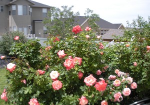
The rose garden outside my office in Herriman Here is a section of my rose garden from my Herriman Home. In my previous home in Clearfield I had rows of rose bushes under the windows & knew I could not be without them ever again after that. In the Clearfield home I had a country garden with two full-grown wisteria’s vines, a large peony planting, with a small sweet pea garden & a honeysuckle vine growing around ninety percent of the fences. There is nothing like vases of honeysuckle, roses & sweet peas on the window sill in the summer. I had hollyhocks also, but they are not my favorite, based off their attraction for bugs or the other way around I mean…

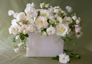
Roses & Sweet Peas in WhiteI am not sure when I began to develop a passion for all these frilly flowers. I was a bit of a tom boy in my youth. I used to wear combat boots with my dresses in my teens…that paints a picture for you doesn’t it? Did I mention that I am a  contraction already?

Maybe my flower lust has something to do with an art assignment I did in High school using acrylics & gesso paints. I am not sure what the criteria for the assignment was (it was that long ago) but I painted a stylized slightly abstracted painting of Roses & Sweet Peas for it. Someone bought it after that. I am not sure who. Some other school I think. I remember taking my money to buy new prismacolor pencils. Yes, that is what you do when you are a poor artist in school. I do however have a digital file so prints can be made up through imagekind if your heart so desired.

“Roses are red violets are blue”…I am going to have a great Valentines day (as long as I get my chocolate) & I hope you do too!

In all seriousness Have a lovely day full of love & happiness my friends.

Love, April Elizabeth

Inspired to Create by…product packaging

3 Feb

So the best made plans often seem to go a bit awry…at least for me. Just as I started this new blog I began experiencing technical difficulty’s. The simplified version is that I lost my computer & a lot of files & data…kind of a set back to say the least.

So with that being said, it wasn’t really my plan that this ‘Inspired to Create by…product packaging’ become my second post, but with February, the month of so-called romance approaching…maybe  this slightly estrogen soaked post will be appreciated.

A few years back I had a beautiful home. My dream home, then & still (being that I still dream about that home). In this home I had a lovely master bath, bedroom & dressing area.

Even though I had the privilege of designing for many clients & filling their homes with beautiful furnishings, in my own home & as a single parent my budget was fairly limited. Despite these limitations I worked to create each space to be simple & functional as well as infusing as much beauty into it as possible.

In my closet/dressing area I had beautiful eastern light in the morning to do my makeup. Which if you know me you know this is an important part of my daily ritual. The vanity area I kept fairly monochromatic so as to not compete with my colorful clothing…all in color order of course…oh & my shoes as well… This was my space. My retreat & I loved it.

I had future plans to add a center island with drawers to expand the storage space, as well as a small upholstered bench & I also had room for a folding screen…I just hadn’t found “the one” yet…this room was really not complete but it was a luxury for me just the same.

What did I say earlier? Something about the best laid plans…

Maybe if so many American’s were not experiencing this I would not even admit it, but I am part of the first wave of homeowners who lost their homes in 2009.

All of the sudden I find my children & I in a “temporary” living situation  where I am having to share a room with my nine year old daughter. I went from having a beautiful sun soaked house to being a renter & a basement dweller.

Good designers know how to work within limitations. I admit I paused on doing anything at first in our shared space, because it was supposed to be “temporary”. At least I really wanted to believe it was.  It was however our place of retreat from the outside world & I knew it needed to be emotionally fulfilling on some level. Waking up in a sparse, ugly, dimly lit room (my things were mainly in storage still)  was & is, no way to start the day.

My dilemma however was, how do I take my decor which was dominantly in shades of silver sage with a dark Mahogany bed & dresser & mix it with the vibrant decor of an almost ten year old girl? Then one day I found it. Right after the Christmas Holiday on the clearance shelf at Walgreen’s.

Bottles & tubes of lotion all decked out in a stylized floral of creams, pink, silvers & sea-foam green. Colors that were all grounded with a touch of black…making the soft pastels seem a tad more mature. This surprisingly  appealed to me, & I knew that this was going to be my starting point for creating a harmonious space for the two of us, without my having to give up the  adult decor.

I have struggled with a love hate relationship with pink over the years…but as an accent & with other colors …I can deal.  On the vanity is where our two separate areas meet as one. The pink I used there was a colder pink, with a touch of orchid.   It all became a bit more fussy than I was used to in my home, but the space needed lots of color & light. Mirrors to reflect the light were essential so I added one on top on the desk (it really is a desk from Ballard Design)  as well as one against the wall.

On my daughter’s bed I incorporated hot pink, teal, black & white pillows on a deeper silver sage green & cream print duvet…. I had a huge assortment of stuffed animals to work around.

My bedding for the most part stayed the same (no sense in buying new for a “temporary” space) with an addition of a pillow coordinating with the same tones of what was existing in my bedding with just a touch more pink.

I purchased two mirrored night stands because they reflected light & visually do not take up much space in a smaller area. I love sparkle & glamor of mirrored furniture as focal point pieces. I am against matching bedroom sets…

I never thought I would ever have pink in my room again. I thought the whole pink thing had ended when at eighteen & I covered over my pale pink walls in a forest green, gold & marbleized…very masculine wall paper. Yes! You guessed it. Late 80’s, early 90’s ish.

The truth is you never know when you will fall back in love with something you thought you were over, (like the color pink) or what little things might inspire you to go a whole new direction. Keep your eyes open. If something catches your eye, it can inspire you to create.

Inspired to Create by the Beauty’s of India…

12 Jan

This is my first official post on this new blog, other than my intro…so here goes!

A few years back I was brought into a new build project by a couple who had originally been working with another designer. The structure of the house was for the most part complete, but it was the finishing touches were what they were struggling with.

Building your new dream home is a huge endeavor.  I had assisted clients  in over 100 new builds at that point &  understood the anxiety they were experiencing to get it right & the need to know that it really was all going to come together beautifully. Both the husband & wife were brilliant Doctors from India, who were both some of the nicest clients I have ever worked with.

The need to visualize was great for them, along with a desire to make their home feel very personal & unique. They had worked hard for many years to get to the point where they could build their dream home, & when it comes to dream homes it is as much an emotional investment as it is a financial investment.

The floorplan itself was designed by Jeremy Gates of Salt City Home Designs. It was a grand entrance with a curving staircase & a large open area below which needed something….based off my other medallion designs we decided a medallion would be the perfect fit.

The home was to be furnished with an eclectic, elegant collection of the furnishings & art much of it from their  native home in India. To me it was vitality important that the medallion work harmoniously which these existing elements… So I began my research….

India had held an impression of romance for me as a young child. Part of this I believe was the story my mother had told me many times of the Taj Mahal. One year for Halloween I remember my mother painting my face brown, spraying my hair black & painting a red dot on my forehead, then wrapping me in a Sari & sending me off to the school parade. It was the itchiest costume I had ever worn, but I felt fascinating & exotic regardless….plus no one even recognized me not even my teacher. It was a good costume.

In my research I was inspired by the delicate, detailed ornamentation of the Indian culture.  From a brides henna tattooed hands  to the intricate  lacy fretwork or repetitive shapes in the architecture….to patterns of embroidered medallions on silk sari’s or embellished metals & gems.  I wanted my design to be reminiscent of these influences.

I came up with three different designs options for the medallion.  After the client selected the one they wanted, I then rendered  options for placement & for the sake of visualizing the colors of the materials & also as important  so they could decide on the direction & placement. Which I used to have an approximately 12′ diameter stone water-jet cut medallion fabricated.

Here is the finished result….

This design is owned & copyrighted by myself, April Elizabeth of A E Design. Any reproduction of use must be approved personally by me. Thank you.