Tag Archives: design

Inspired to create by a very lovely client…

8 May

I have often wondered if I could break down my processes of creating to help those who say they aren’t creative be able to find their creative power. Maybe it is possible, but sometimes for me it is an elusive process. I rarely approach creating the same way every time. While Inspiration is a huge factor in creating, it is only one part of the process.

I can know in my head exactly what I want to create but if the timing isn’t right or I’m not in the right mindset it is often hard to put on paper & get it out of my head to a presentable medium. I recently had an amazing opportunity to create something bigger than I ever dreamed of creating. Believe me; I have a lot of big ideas & dreams when it comes to creating products designed by my own hands.

This though really pushed the limits of what I ever dreamed I could do. In fact, I probably never would have considered ever putting myself in this position if it weren’t for my very lovely client Lynette. Over a year ago Lynette hired me to help her & her husband create their dream home. I did not know at the time what a blessing this would be. There were many challenges along the way but I did my best to try to capture their vision & stay focused on making it a reality. I am very grateful for the opportunity to be able to do what I do best for these very deserving clients.

I did a lot of designing & collaborating with other talented folks throughout the process of designing the home. I created everything from custom fireplaces to elegant decorative finish work. I plan to write about some of those designs as well, but anyone who follows me knows my writing can end up on the back-burner somewhat.

If you follow me on instagram you may have already seen this project or the decorative library ceiling I painted. It isn’t typical for me to do work like this for my clients. Because of my background in art I am perfectly capable, but it is time consuming & stressful & as many artists know unless you are compensated for your time it isn’t always worth it. The turret ceiling took this to a whole other level by being so much more time & work than I anticipated. I knew though that I just had to plug through it & make it happen. I am lucky that I had the support I did, so I could get it done. I am so thankful for that.

I really started the process of designing it months before it came about. There was so much to do to move the house forward & there were many changes & additions. Every now & then she would say, “it would be nice to do something with that ceiling up in the turret.” I would agree with her, but we did not yet know what we were working with until the finish carpenter had completed his part of the installation.

I had grown to enjoy my client & her family so much. I was obsessed with making sure her home fit all her expectations. This is their dream home after all. She was a gem through every little problem that would come up in the building process. I also knew that when you start designing a high end home & putting high quality products into it, that nothing can ruin it more than having some element that is unfinished or non-related that somehow randomly sits in the midst of the design. I saw that the entry turret despite all its beautiful finish work was not going to look right without a little something more.

Design concept for Dashner Turret Design owned by April Elizabeth of A E Design
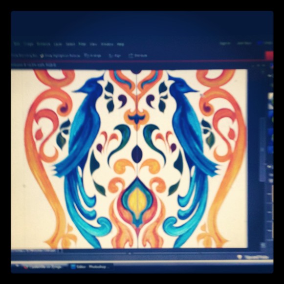
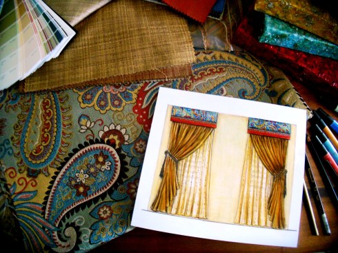
There was so much to do but in the meantime on my downtime, I would try to sketch out options & ideas, at first I was hitting a designer’s block of sorts. I would continue to doodle knowing that even when I am not feeling it, sometimes I will have one little element that seems to lead somewhere.

I keep all my little sketch books for this reason. Sometimes I am doodling designs without a purpose but they are great & I am thinking how can I apply this to something? When I am struggling I go back thorough all the books & try to find elements that I can work with. It is rare that I sketch out a design perfect right off the bat. Sometimes It takes a lot of attempts to get things going in the right direction. This was probably one of the hardest designs to come up with. It took me a lot of time thinking & sketching it out.

I am extremely sensitive to my environment so sometimes my inability to create is because of surrounding distractions & then sometimes I am even fighting with little nagging subconscious fears that I won’t be capable of getting it right. I hold myself to very high expectations & when I am designing something I have never done before…it can be a small internal battle. I have learned a few tricks to deal with this though. I know the end result shocks everyone who has seen it including myself, but I wouldn’t want anyone to make the mistake of thinking it was a smooth process.

Up on the scaffold for AE Design Dashner Turret Design
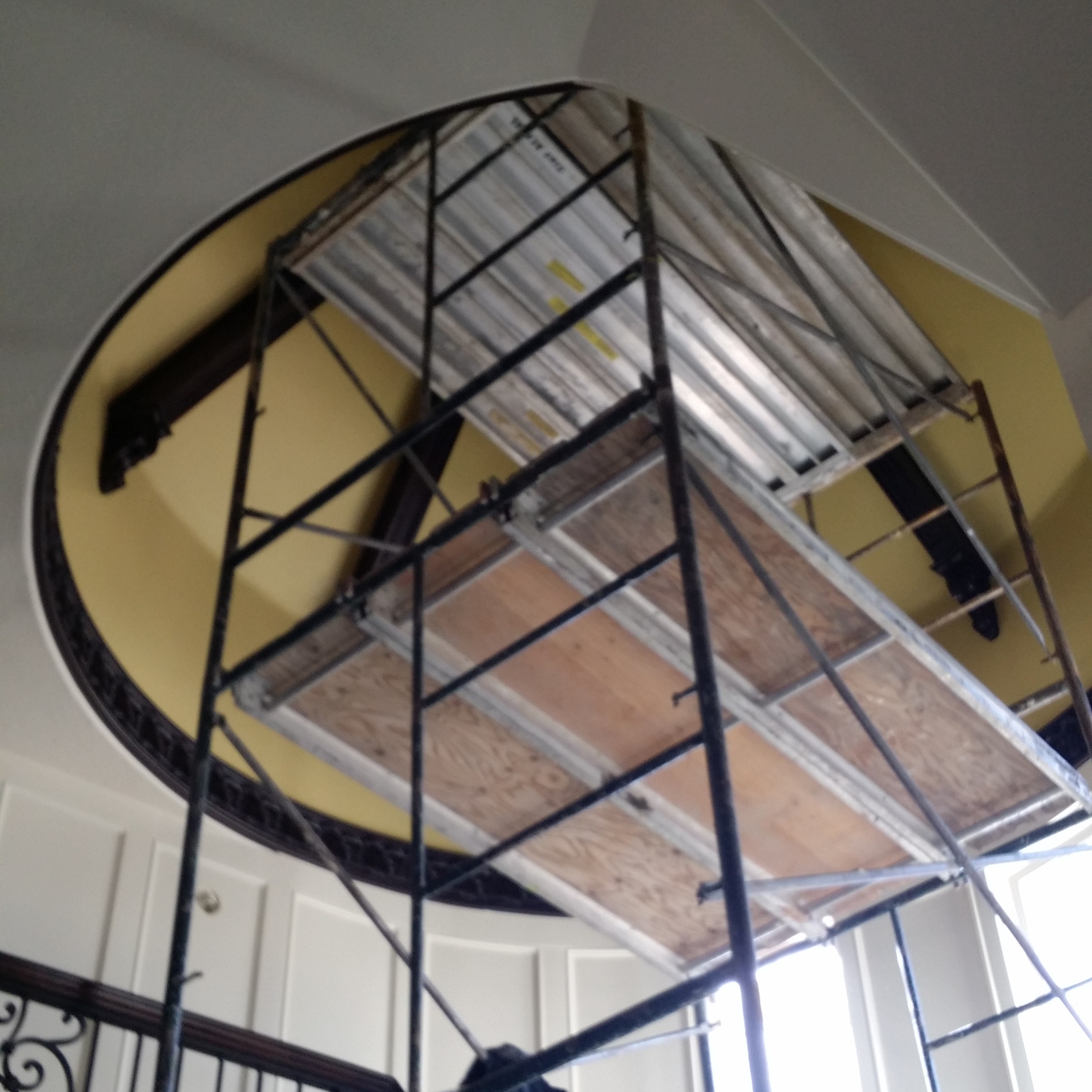
Getting up on scaffolding when you are afraid of heights really makes you face your demons. I had experienced it a few months before when I painted the library ceiling. This was much higher & more difficult to reach. I am lucky I had a helper though. Still I have never experienced something that pushed me to the edge quite so much…the closest thing I have ever had to this feeling was when I was getting my interior design degree & pulling all nighters to get my presentations ready. I was a mom back then as well so I wore as many hats as I do now.

Moving Forward with the Dashner Turret Design by April Elizabeth of AE DesignTruth be told I would do it again. Maybe I wouldn’t have so many demons to fight off now. I found that being up high in a precarious situation made me feel vulnerable & like I didn’t have much control. I would run into trouble when I would find out the walls weren’t even or the template that was made for me wasn’t accurate. Things would take longer than I wished, then at night I would have to go home to modify or re-cut my reverse templates.It was an all consuming project that took over 100 hours. After I hit that marker I stopped keeping track.

The reason I would do it again? I have figured out through trial & error what works best but most importantly, It was a labor of love. I put a lot of my heart into it. There is something so powerful about creating something beautiful that always drives me to push through any discomfort that comes up, just so the finished result can come to life.

Honestly it is a good representation of how life can be. Things don’t always go well or the way to you plan. Sometimes you are wondering how this will ever work out. There are bumps in the road but if you keep persevering & keep your eye focused on the end result you can make things beautiful.

Dashner Turret Design lit up by the Chandy Design by April Elizabeth of AE DesignWhen I was up there I thought about their family & how many years of enjoyment they were looking forward to in their new home. I imagined their daughter someday standing on the stairs getting her pictures taken for prom or the boys walking up the stairs to their rooms after a long day of sports & activities. It is beautiful enough they could have a wedding in this home.

Even if they forget their designer down the road after all the work is done, I hope that somehow the love & respect I have for them will radiate from my work for years to come. I don’t know how it couldn’t. I left a little of my heart behind when I was painting.

Dashner Turret from below  Design by April Elizabeth of AE DesignMy daily goal is to fill the world around me with beauty & love…that to me is what it means to be lovely.

Inspired to create by…an antique set of silverware

23 Jan

I am constantly inspired by nearly everything that comes my way whether via the web or my daily surroundings.

The only disadvantage to this is that I only have so much time in a day to act on ideas that will flood my mind. I am constantly leaving myself little scribbled sketches with what I hope will be just enough information about my vision, which I can hopefully discern for processing at a later time.
Yet it doesn’t always work that way. I can tell you looking at such scribbles a year later, even when they have color lists that were a big part of the idea with the intention of triggering the scene back into my recollection…the ideas are often lost.

It is difficult sometimes to resurrect these little creative surges & downloads. It probably doesn’t help that these creative blasts like to come during the most inopportune moments…such of those of deep exhaustion as I am lying in bed helplessly falling asleep.

You may ask what my point is? My point is this…I’m a constant creative magnet taking in more data than I can process into actual tangible results. My list of what I hope to paint, design & creates grows longer everyday even though my time to do it seems more limited. This however does not mean that I am not creating at all…quite the contrary. It means that my focus has become less of the things I want to do & more on what my clients needs are at the moment.

I have created some amazing designs in the past little while…some of which are top secret. Those that are not, rarely get much time in the spotlight as I quickly move on to the next task. Quite frankly I am suited to this sort of variety. There is nothing monotonous about my design business. I am just terrible at taking a moment to write about it & share.

That being said…a cross between apology & justification for not blogging in a while….I am going to share a creation that has been a while in the making.

Many of you who are close to me know I have been dating Craig for a long time… about five years ago his mother gave him some of her older furniture & antiques when she got re-married & moved away for a time.
One of these things was a set of silverware.

Not being a pro in the antique business. I’m not sure how to find the years, dates & values of things. All I know about this silverware is that it looks really old. I think it is stunning though. It fulfills all my beliefs about what old fashioned romantic silverware should be like (it is my Libra mentality to romanticize nearly everything).

Silverware from the Hewitt Family
Unfortunately the picture I have of it is not very flattering. Something about this designed medallion really struck me & I found the design fascinating.

In 2009 I was volunteered to refurbish some props for the Mountain West Ballet, Nutcracker performance. When it came to decorating the large presents that some of the dancers come out of, I decided that the only way to make it look like wrapping paper was to stencil them. It was difficult finding large enough stencils…so I resorted to creating my own using the silverware medallion as my inspiration.
It turned out so well that I never forgot the thought I had, that this pattern might look nice as a fabric pattern….

Vintage Bird Nutcracker Gift Boxes Designed by April Elizabeth for Mountain West Ballet
Back when I was very young, I had this dream. It was a big dream that carried me through my youth & teenage years. That was the desire to be a fashion designer. It may have been my exposure to sewing. I had been sewing since I was five years old…maybe it was the piles of old pattern design books I would track down at all the libraries & spend hours reading. Yes. That has to be it. The library…

I was driven to design clothes. Much of my teenage years I was self educating myself in such things.

It was this time spent, reading, studying, sewing, making my own patterns & clothes (otherwise I was limited to hand me downs) that taught me a great deal about textiles. Years later when I ended up on the path to an Interior Design degree, this knowledge came in handy because I knew them inside & out.

Knowledge is one thing, but I also loved textiles & fabric. I read everything I could on repeats & fabric design but so much of it was vague…almost protected information. It was hard to find much information & the tools to print, silk screen & paint my own fabric would be difficult to justify as a hobby.

Since that time I have wanted to have my own fabric line. Truthfully, every time I see a designer with their own fabric line I will pour over their bio to try to find out how they got started. Each line says so much about the designer’s personality as well as design style & I find it fascinating.

Duralee happens to be my favorite fabric companies to look at such designers, because they really put a lot of emphasis on their talents & lines. To private label with a company like Duralee…that would be the dream.

In researching fabric designers, I know there are people who specifically design fabric & do the artwork to help fulfill many a designers’ vision. For me being an artist before getting my Interior Design degree I decided it was time to challenge myself.

I needed an easy subject to start with so I defaulted to one I already had a myriad of sketches for. The bird medallion inspired by Craig’s antique silverware. Knowing that I could change the colors to any that I wanted later on, I made the decision not to invest in new paint. I painted it with what I already had & considered each color as a separator to each other.

A E Design Original Scanned Design of Vintage Bird Medallion
Then I scanned it into my computer & began using Photoshop to clean it up. This was a long process since I had to work on it in bits & pieces as time allowed. Then I played around with various filters…

A E Design Playing with color for the Vintage Bird Design
Many color samples later & it was beginning to look really decent. Then the craziest thing happened….
After looking for months for the perfect fabric for one of my clients…one with all the colors she wanted to bring into her home, I heard myself throw out the idea that “maybe I could design it?”

Well, she wanted to see what I had right away. She loved the design. It was transitional leaning into a traditional vibe, so the process of getting each fabric right began. It took time & weeks every time I would order a new color sample but finally we got it right.

IMG_20140621_092932
Then because she was ready to rock & roll…I used my sewing skills (which I had put in cold storage for a few years) & made eight back tab panels of 132” drapes, fully lined with blackout lining.

A E Design Sewing my custom fabric into drapes
I am really happy with the result & what I learned from this experience is invaluable. I may not be designing exquisite textiles for a high end designer fabric company, but I can design fabric. In fact I am planning to design a few things with my antique bird design & see how they sell online.

Azure Elizabeth Design Vintage Bird Fabric in Red & Gray A E Design

Azure Elizabeth Design Vintage Bird Fabric in Teal & Black A E Design The other thing I learned is that I need to have someone else do my sewing sometimes, just so I can keep myself moving forward & creating as well as get in some Z’s.

These particular color combinations were put together for my client. To see more of my colorways in this “Vintage Lovebird” pattern feel free to visit my spoonflower shop. Azure Elizabeth Design Vintage Bird Fabric in Redl & Gray

Inspired to create by…the perfect paisley, and the elements fire and water

19 Dec

For those of you who know me well you know that I juggle a lot of balls…though the truth is that because of my juggling act, very few people know me well enough to actually realize that. I confess…I am an extremely private person who only gives small glimpses out to others about my person which are usually based on content, subject matter and need. If there is no need then there is very little divulged leaving others to make assumptions about me, which they often do…I admit this can be quite interesting at times…

Can I get any more confusing? Yes! I guarantee I can.

Astrologically speaking I am dominantly Air and Fire with one sneaky little water sign planet, Scorpio…My Sun sign is in Libra. Yes, that is where my vanity comes from as well as my desire for romance and my love of beauty. On Twitter I refer to myself as A Lovely Designer…to understand why I use Azure as my alter ego go here…I use the word ‘lovely’ symbolically because if represents a combination of the two ideals, love and beauty that I equally value and try to create in life.

Love is emotional and beauty is visual, often stimulated by physical or environmental influences but at times they merge together into one. If I ever tell you to have a ‘lovely’ day I am wishing you actual love and beauty to be manifest in your life.  To me it is as positive an emotion as wishing you much happiness.

If  I tell you something or someone is “lovely” I am saying that to me it/they are of more value to me that just the superficial  appearance and that the worth and value runs much deeper with me.  This word is used in reference to people I value and love and the things they create. If I can see them or their heart in their creations there is nothing more lovely to me.

Now back to my astrological chart…I know you are just dying to know more…alright whatever! Indulge me please, I promise it will make sense shortly. I am more on topic than you think and this is an only round about apology for not posting more often.

So where were we….oh, yes…so my Moon is in Gemini, and this is where the importance for communication comes in. I am a communicator and nothing annoys me more than people thinking I can read their mind…I may be intuitive but I wont give you the pleasure of knowing what I read. It is not my responsibility, so If you don’t tell me something please don’t expect me to know about it. I am so not a busy body either…but we will get sidetracked if we go there…I also don’t take words, commitments and promises lightly so if you can’t walk your talk there will be probably little trust between us…unless it is something trivial that I don’t depend on to function.

I give the Air signs the credit for my being a bit of a free spirit…one who is attracted more to movement than being stagnant who moves quickly from one idea to the next. The free spirit comes in handy as an artist and designer and it allows me to be open-minded but it can mean I live very much in my head and will often put logic over my own heart and sometimes block myself from my emotions…something I am learning to recognize and be more careful about.

Now to top that all off I have two planets in Leo, one in Venus and one is Saturn. Darn it! I have not yet figured out how to allow my inner Leo’s out of their cage because Saturn is standing on my tail. Saturn, will always repress, suppress or oppress the planet it is in.

So how is this relevant to my Inspired to Create blog? Well, taking what I have learned about my own self from astrology, and seeing my strengths and where I am out of balance…I have used this understanding with the assistance of my Astrologist David Porter to design and create an environment for one of my clients. It is still a work in progress but until we addressed his astrological chart we just weren’t making any progress.

DSCN1584

My clients astrological chart is an almost split down the middle with only Earth and Air planets. This means that the emotion that is represented by the Water planets and the passion of the Fire planets was somewhat void in his life…which he admitted too. This process spoke to him and when I suggested that we bring in colors and patterns to symbolize his missing elements it resonated with him. Then I found the perfect paisley fabric to honor all of the elements with reds and oranges to represent the missing fire and blues and greens for his water. Earth is represented by earth tones and air by the color yellow.

Designed and Painted for Lehi Client by A E Design Side View

I love using symbolism in my designs when I can. It is like turning your environment into a vision board so to speak and what better way to reach your subconscious than that?

Designed and Painted for Lehi Client by A E Design representing air earth and water

So here are a few glimpses of what we are using in the space as well as some custom art work I created for it. He was very patient with me since my gypsy like spirit means I can sometimes have a lot of irons in the fire.

Designed and Painted for Lehi Client by A E Design the whole collection

And here is the light that will be going over the kitchen table in a few weeks. I couldn’t help but give you a sneak peek.

4013_6+3AQ

Save

Inspired to create by…the Goddess Aphrodite

30 Oct

Well here we are finally. I have teased you all long enough. At last I unveil my newest project…which if you saw the last blog, ‘Inspired to create by Queen Elizabeth the 1st‘…you knew it was coming though I am fairly sure I didn’t give too much away.

This project was a daughter inspired project, 100%. My twelve-year-old daughter is becoming such a ‘designing woman.’ She recently got hooked on these Goddess Girl books, and came to me with her brilliant idea of being Aphrodite for Halloween. She even tried to get all her girlfriends at school on board and each be a different Goddess…what did I say about ‘designing woman?”

Image

Well her plans are very well thought out and usually seem to involve my sewing skills. I really dropped the ball on teaching her such skills…I have a lot of time to make up for since I’ve been sewing since the age of five.

Well I am sucker for any design plan especially since she was giving me full rein on the design. I would show you my original sketch except that I ended up going into a little bit different direction allowing it to evolve and flow. Since my daughter was the client so to speak I can do this. Usually I confine myself to an agreed upon concept, but here I didn’t have too.

As the mother and the teacher I walked her through the steps of how I come up with any design. She was referencing the cover of the book with the cartoon looking character and I was leaning toward the idea of making it her own (this is really very similar to working with any client who always starts with a concept that is another persons design) so we collaborated. Which mainly meant that after she told me what she wanted, she was part of all decisions that I came up with and threw at her.

Trusting little angel that she is. Honestly she has to be my favorite client.  She gives me such exciting challenges to work on in a medium I rarely get to work,  without trying to control it all.

This is what we ended up with. I wanted the robes to be flowing with layers of interest all around as though they were long yards of fabric tucked, gathered and bound together to make the dress…and she sure does she look amazing in red and gold.

Enjoy and have a happy safe Halloween!

Inspired to create by…Queen Elizabeth the first

2 Oct

October is a somewhat magical month for me. All the beauty and richness and color of September goes bold with intensity and drama. The full moon seems bigger and bolder. Almost overnight I become obsessed with the rich decadent pleasures of life. Baked goods which hardly ever seduce me become constant haunts especially when spicy pumpkin chocolate chips desserts come into season… and with Halloween around the corner I become obsessed with contrast, gaudy pieces and drama in my decorating…

Costumes become the big focus for my children and I, which they seem to find more delightful than their passion for treats. This year is without exception for my little designing daughter who has big plans for her mama’s designing talent. You will want to stay tuned since I wont be letting the cat out of the bag just yet.

Not since her fourth grade year has she felt the desire to make me so ambitious. For years (although not every year) I have made costumes for my children. I try to get around it when I am able, since it can be fairly time-consuming, but just like my memories of my own mother making my costumes they find there is something rather magical about the whole process.

In Autumn’s fourth grade year they were required to do a wax museum report. This was where they do the research on a particular person from history, who they then dress like and they hold very still while the parents walk around the room looking at them and their poster board with its research.

Image

Well she came home one day and said that she had chosen Queen Elizabeth the first. Mainly because her middle name…like my own is Elizabeth. I looked at her in shock. How may I ask am I going to find a Queen Elizabeth Costume. “You will make it” she stated. “I know you can mother.”

ImageShe is a lucky little girl because she was right and I did make it for her, I also made her swear that she would wear it the next Halloween since it wasn’t going to be an inexpensive or simple costume to make. She kept her promise and was a stunner as the Young Elizabeth Tudor.

ImageShe wanted to be as authentic as possible so I used temporary red dye in her hair. Since she has a reddish caramel tone natural she pulled it off brilliantly. After a few hours she did find the ruff a bit itchy so I freed her of it. It is a lovely costume either way and was so much fun. I can’t decided if I enjoy designing wedding dresses or costumes more.

Image

Inspired to create a wedding dress by a ruffled cake…

13 Jul

I have no doubt if you follow my blog that you have been waiting with bated breath to find out the outcome of the wedding dress project…or if I am being realistic you’ve probably forgotten actually about it.

As many design projects go & what seems to elude most of the public…designing is a long-planned out process, Nothing is created in a half an hour to an hour segment. Despite what the media wants you to think there is rarely any instant gratification in the design world.

The itself dress started out as a conversation in April. Nicole (if I had, had another daughter I would have named her Nicole, love the name) has known me since 2004 when I worked as the Interior Design Director for a large home builder. She was the sassy little receptionist who kept everyone on their toes with her playful sarcasm & quick wit.

Things have long since changed & we are both in different places in our lives…the builder is no longer around…but as facebook friends we have made sure to keep tabs on each other.

According to her I told her way back when that I would be happy to make her wedding dress when she had asked me. Other than the costumes I made on  Halloween’s for my children I am not sure how she knew that I had a thing for needle & thread.

Okay I don’t…not exactly. Needles & thread are really a means to an end. What I love it designing. I have been sewing since I was five. I started out by designing dresses for my Barbie’s. I really never played with them I just sewed & designed clothes for them. I was very common to find my naked doll with her feet stuck in the bottom of a large spool of thread so she would be held upright, acting as a dress form.

The truth is my plan was to be a fashion designer first…others things happened though. I am essentially self-taught & during my teens I would devour every book on clothing construction I could find & back then it wasn’t easy to find such publications. Most of the instructional books were from the 40’s & 50’s.

So there is a little History for you. Nicole & I discussed the dress & she came to visit a couple of times to go over things. I encouraged her to go look around at prices & styles before she made the decision to have me make it. I wanted her to be completely committed to the process because it is a huge commitment on my part as well & because she lives in Vegas & I live in Utah she would have to arrange to come here for fittings.

After a few rather discouraging shopping trips & going over photos with me of what she loved & didn’t she decided to give me a shot. Kudos to her for faith because she hadn’t seen what I could do yet. All she knew is that I can sew.

I pulled together some concepts to help her narrow down the look she wanted based off her preferences & emailed them to her & waited to hear back. It cracks me up now thinking about it but I think it is an important part of the process. This is something I encourage my clients to do in the most appropriate manner, & that is communicate.

No matter what we are designing we don’t read minds & we need your considerate feed back. We also need you to be present in the process. “April” she said, “I love these but I was wondering if you can add a ruffle?” She was so nervous when she said this, uncertain of my response. She had tried on a dress with crumb catchers…huge ruffles on the bodice that drowned her but she got emotional when this happened because it reminded her of a cake she loved…this is the key. The emotion. We designers want results that get to the heart of your dreams & desires…the emotion is a clue to which direction we should take.

I was so happy that we had hit that deeper level. I asked her to please send me a picture of the cake & that became my inspiration for the dress.

Image

This was a 400+ hour process. Between concept drawings, creating the pattern & a mock-up dress out of muslin first to making the actual dress it is a big job. We were able to coordinate everything smoothly with her visits from Vegas for fittings which had me more that a bit nervous. Designing & making a custom dress for someone who lives nearby is one thing, but one who lives in another State is different story.

I am happy to say that she is thrilled & she looks amazing in it. It is perfect for her…made just for her. I also have a new love for ruffles…as long as they are done correctly. I affectionately call them Fruffles now.

If you follow me on Facebook, twitter or Instagram you may be so lucky as to see the bride in the dress since I plan to take pictures tomorrow night at the reception.

Image

Also I ask my  friends & sister Heather in Arizona for forgiveness from with holding photographs until now.

Inspired to create by…some hard boiled eggs…transforming them for the our Easter Celebration.

6 Apr

I could go on about how lovely Spring is & what an inspiring time of year it is to see new life, all the flowers coming up out of the ground & the blossoms on the trees. The truth is Spring has always been my favorite season, well right next to early Fall, but I woke up this morning  & it was almost 30 degrees & snow was everywhere. I was not the heavy kind, but the wet snow that sticks. It was quite a sight on all the neighbors white blossoming trees. Yes, I live in Utah where the weather is quite fickle so Spring & I are not speaking to one another right now.

It may have been the cold & the fact that I could not find my winter coat this morning as I walked, No! Ran out the door to meet with my accountant…Frankly I was not very inspired when I faced the day & was more irritable than usual…I am not a morning person by any stretch of the the imagination. Today I was sure when I woke up I was not even going to be a April 6th person, but four hours later this all changed.

Suddenly after weeks & weeks of extreme busyness trying to get ready to file my taxes & juggling my other responsibility’s I felt free! The children are on Spring break so we decided we might as well do our egg dying today. This got their cute little noses out of the books they were reading & gave us some time together.

I took one look at those white hard boiled eggs & suddenly I was feeling ambitious. We were at my mothers house so we set out the dye just the way I did as a child. We put garbage sacks on the table with layers of newspaper over the top & for the dye we put one tablespoon of vinegar in each cup with boiling water & more than a few drops of McCormick brand food coloring in each cup.

I put two layers of tape lined up next to each other about four wide, with each layer going the opposite direction to reinforce it on a piece of wax paper. I used blue painters tape on the bottom because it is easier to remove the wax paper off of than the Scotch tape which is firmer. Then I drew a design over it with a fine Micron marker & used fingernail scissors (my secret tool for cutting out fine detail & curves) to cut it out & then used the tip of an exacto knife to carefully remove the wax paper off the back. Now I had a way to transfer a design to the egg.

I put the egg  in yellow dye briefly so it would be a soft color underneath the tape. Then I let it dry completely before I applied the tape design, rubbing it softly to make sure it would not slip off. First I dipped the egg with the design in a warm green. After a bit I removed it & let it dry. Then I added a few more sticky stencils then I let it sit in the cooler almost jade green dye.

The fun thing about using the tape over the eggs is that  the dye will leak under it a bit…fairly randomly & when it does it gives the area  a sort of tie dyed look. We all got pretty creative here but I may have gone over board. Once I get an idea in my head I have to try it. That is why I have an animal print egg & a few abstract eggs to go alone with my floral designed eggs.

My children & I have  not spent this much time dying eggs in a very long while. It was nice to let our creative juices flow & just enjoy a project without feeling like we had to hurry to move on to the next thing.  For me doing this kind of casual design that is for no one but myself is a great way to recharge my battery so I can tackle the bigger more serious design stuff. It is as good for me as meditation.

If you still haven’t dyed your Easter eggs yet & are looking for a way to mix it up a bit give this a try. I would love to know how they turn out. Happy Easter for all of you Easter celebrators!

Inspired to Create by…Saint Patty’s Day!

18 Mar

It has been a busy last few weeks for this designer. It has been such a whirlwind I am not even quite sure when I posted last. There are some big changes in the air & the biggest one that has taken much of my focus has been my new gig writing for the online examiner as the Salt Lake Interior Design Examiner…my official title. As much as they want local content, design is design…so I have made it a point to make sure my articles are informative for anyone who wants to get inside my extremely complex designers head…scared or intrigued? No really, it is not as bad as it may sound & I think it is worth checking out.

St. Patty’s Day is coming to an end & first let me just clarify why I call it this, lest you assume I just enjoy a bit of sacrilege…which I do. I am fully aware that it is called Saint Patrick’s Day but this day is even more meaningful to me than a day to dye your beverages green & wear the color of grass from head to toe. Today, March 17th is my mothers Birthday. Now don’t go asking which one because she has never confessed her age to me & since I was never the child to snoop through the house trying to find gifts & hidden secrets, I have just left it at that. If I really need to know I can find out.

Since her middle name is Patricia I often will call it Saint Patricia’s’ Day (truly she is one) but you would all be seriously confused….& sure I was disturbed (which isn’t impossible). There is also that little dilemma that my exes name is Patrick. You understand now right?

These past two days I’ve restlessly needed a break from my writing & at the spur of the I moment came up with two ideas for a couple of little paintings. I have been intrigued with the idea of using seasonal or themed paintings & art work for decorating with during the holidays. I had two little canvases that were already prepped with green textured paint that I had set aside. All of the sudden I decided, quite at the last-minute to put all my focus into them & transform them into something wonderfully lucky. Here are the results. May you all find rainbows with gold at each end & may the grass always be green on your side of the pasture. May the Luck of the Irish be with you my dears!

Image

Inspired to Create by…Pratt & Lambert’s Chinese Orange

25 Feb

No matter how much I love color or how long I have worked with it, I find that much like my relationships with others there can be a bit of an ebb & flow as to how much they are in my life at the moment. You probably know what I mean. You have friends who move away, live in another city, run away, get married, take work transfers, or even the adventuring types who won’t stay tied down to anywhere for very long…you get the idea.

Then there are the friends who you haven’t talked to since high school or college, but  one day through a phone call or a visit & your relationship is strengthened & revived. Once someone is a true friend they always are, even when life just gets in the way at times.

Well I fall in & out of love with color almost the same. It isn’t that I ever stop loving colors really, I love all colors (just like I love all my friends) it just depends on how the colors are applied or in my life at the moment.

Sometimes certain colors are less in the forefront of my thoughts than others might be. I think much of this is due to the seasonal & yearly trends as well as my clients needs & the trends of the geographic area or the demographics I’m working with.So with that being said, it can be understandable that I am often excited about  old colors that have become new again. It is much like becoming re-acquainted with a  childhood friend. Right now the colors I am renewing a relationship  with are apricots, peach’s, tangerines & corals. Four colors I hadn’t seen much of until about a year ago when they started popping up in textiles & design work everywhere. These new/old colors went from being nostalgic reminders of my youth…to being all grown up with all newer versions of themselves, that are now being cleverly used in vibrant, rich, elegant spaces. So in a way I would say as well as being reunited with some old friends, I have also made some new ones. I’ve been so inspired by these warm tones that the end of last summer 2011, I begin playing with the idea of using them in a set of stylized paintings that I had sketched out as a concept, but hadn’t yet decided what color direction to take. I started looking to various inspirations. I love the tangerines & apricots blending into cool pinks tiptoeing into the territory of the color coral such as the photo of the table setting above that I spotted on Pinterest the other day. Coral itself can be more complicated. There are coral pinks & coral reds with many tones & shades in-between. These are vibrant, sensual colors. I love them all equally & in trying to decided what direction to take, I desired to find a color to base my work off of that bridged the gap between both the pink & the red.

That is when I found Chinese Orange from Pratt & Lambert paints. Deep enough to lean towards the red direction of coral, but pink enough to be sultry & hot. The photo above shows the original texture & color blending of my canvas before the design was added, along with some inspirational photos to reflect the colors I used.I love the contrast of cool colors against warm colors because these opposites enhance one  another. I wanted the design to stand out so that was how I decided on the abstracted floral’s textural color. This raised design is a combination of textural paint mediums including  mica flakes suspended in acrylic polymer. The surface of the canvas had to be smooth to apply the top layer of pattern, so I used transparent gel acrylic which gives it depth so you can look right through it & see the dimension.

The truth is this was all very experimental on my part. I had used these various mediums a few years before for some commissioned art work & knew that I was only scraping the surface of these products potential. I wanted to do more.

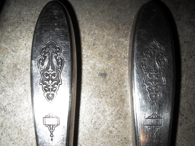
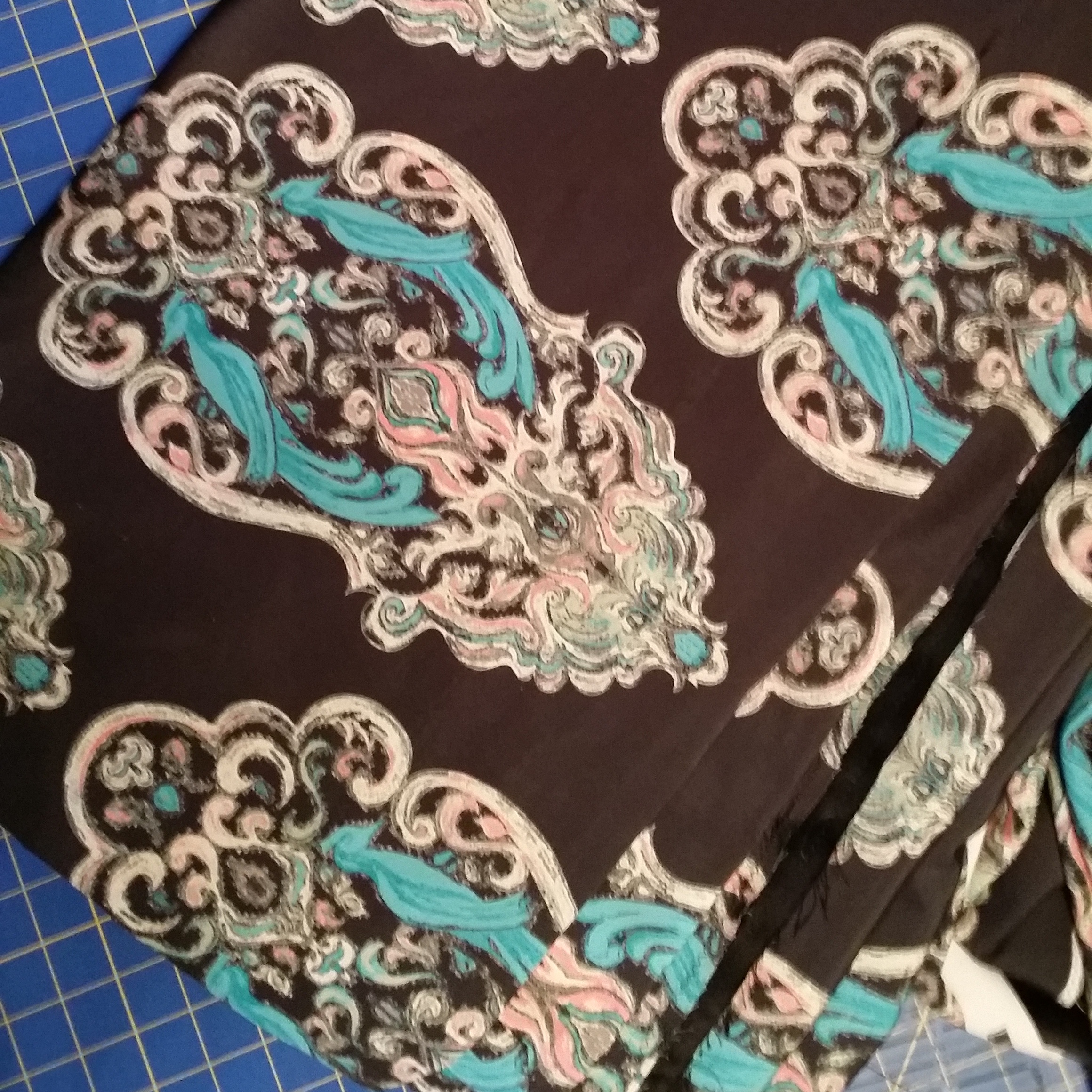
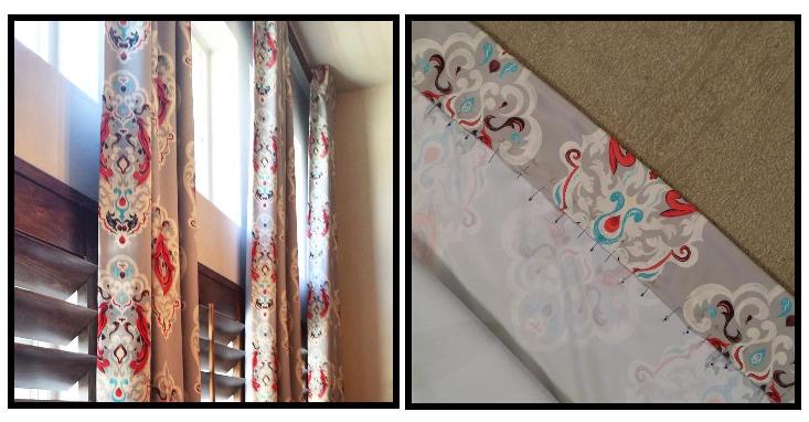
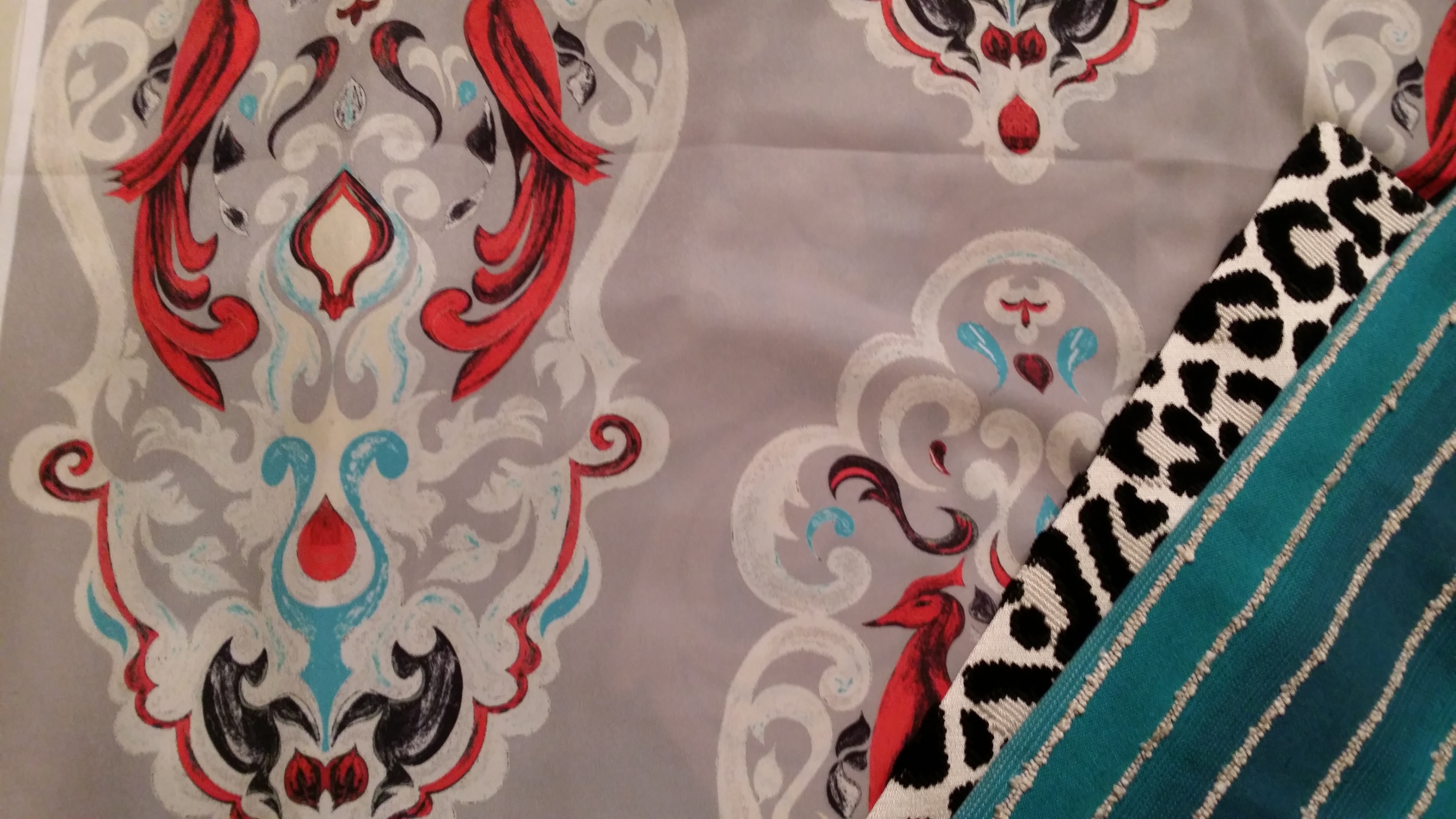
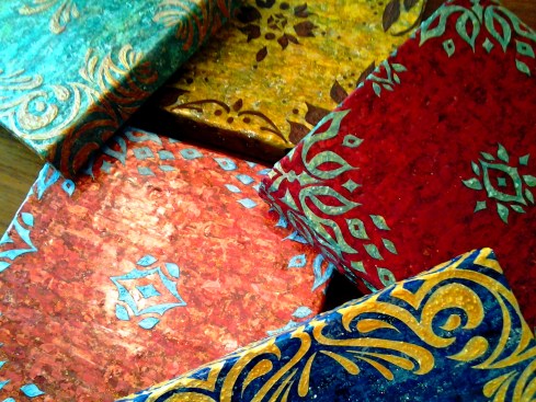
The idea here was to create art work that had some flexibility…I have my logo/initials embedded subtly in the acrylic resin in such a way that you can hang these four pieces in any combination you wish & not see it unless you were up close. This set is the only one of hundreds of thumbnails with similar concepts. At some point I plan to take my designs into my own textile line.

As an interior designer, I realized I could not just create the art without envisioning the space  or color story it would belong in. I decided to give Olioboard some of my time & see what kind of concepts I could come up with. This  mood board creator program has so many possibilities. These are all merely concepts, but hopefully they will help you envision some of the possibilities of  these new paintings ‘Coral Blooms.’

Blue, turquoise, tangerine & coral tones. This color story reminds me of a cottage by the sea. It can’t take itself too seriously when vibrant corals with hints of copper & orange (a touch of tangerine tango, Pantones 2012’s color of the year) are juxtaposed against a powdery blue & vivid turquoise.I love the dynamic contrast of  monochromatic neutrals such as whites, blacks & grays with a pop of color to spice things up. If you love bright colors, but the idea of painting them all over your walls, or using them in your furniture  terrifies you, then using a neutral based palette & implementing color into your decor & a few key accent furniture pieces is a lovely compromise. I truly believe every space has the potential for showcasing the colors you love most, even if it seems they may be too dominate & daring to work with. This is where utilizing the experience & expertise of a professional designer can come in handy.

This set of paintings was intentionally created toward a more feminine direction, which depending on how they are hung will emphasis that quality more or less. I rarely get to do rooms with a more  feminine appeal with my actual clients…unless you would  consider my eleven year old daughter a client which I do, but she may not. The trademark of a more feminine feeling space is often in its use of color, although there are many other design elements that can create that more feminine feeling, such as the lines of the furnishings & accessories…I think the mood board above illustrates what I am talking about.

I love mirrored furniture for its lightness, It can be fresh, light & glamorous but it can also be used to create dynamic & dramatic contrast in a space…that is a different mood board & blog post though though. Periwinkle & I have had a bit of a strained relationship I will admit. I mentioned it in my other blog a few months back. It isn’t that I dislike this color it just is so much better company in an environment where others can feel included…such as the vivacious Chinese Orange & the subtle but charming silver.

Have a wonderful weekend everyone!

Inspired to Create by the Beauty’s of India…

12 Jan

This is my first official post on this new blog, other than my intro…so here goes!

A few years back I was brought into a new build project by a couple who had originally been working with another designer. The structure of the house was for the most part complete, but it was the finishing touches were what they were struggling with.

Building your new dream home is a huge endeavor.  I had assisted clients  in over 100 new builds at that point &  understood the anxiety they were experiencing to get it right & the need to know that it really was all going to come together beautifully. Both the husband & wife were brilliant Doctors from India, who were both some of the nicest clients I have ever worked with.

The need to visualize was great for them, along with a desire to make their home feel very personal & unique. They had worked hard for many years to get to the point where they could build their dream home, & when it comes to dream homes it is as much an emotional investment as it is a financial investment.

The floorplan itself was designed by Jeremy Gates of Salt City Home Designs. It was a grand entrance with a curving staircase & a large open area below which needed something….based off my other medallion designs we decided a medallion would be the perfect fit.

The home was to be furnished with an eclectic, elegant collection of the furnishings & art much of it from their  native home in India. To me it was vitality important that the medallion work harmoniously which these existing elements… So I began my research….

India had held an impression of romance for me as a young child. Part of this I believe was the story my mother had told me many times of the Taj Mahal. One year for Halloween I remember my mother painting my face brown, spraying my hair black & painting a red dot on my forehead, then wrapping me in a Sari & sending me off to the school parade. It was the itchiest costume I had ever worn, but I felt fascinating & exotic regardless….plus no one even recognized me not even my teacher. It was a good costume.

In my research I was inspired by the delicate, detailed ornamentation of the Indian culture.  From a brides henna tattooed hands  to the intricate  lacy fretwork or repetitive shapes in the architecture….to patterns of embroidered medallions on silk sari’s or embellished metals & gems.  I wanted my design to be reminiscent of these influences.

I came up with three different designs options for the medallion.  After the client selected the one they wanted, I then rendered  options for placement & for the sake of visualizing the colors of the materials & also as important  so they could decide on the direction & placement. Which I used to have an approximately 12′ diameter stone water-jet cut medallion fabricated.

Here is the finished result….

This design is owned & copyrighted by myself, April Elizabeth of A E Design. Any reproduction of use must be approved personally by me. Thank you.

%d bloggers like this: