Inspired to create a wedding dress by a ruffled cake…

13 Jul

I have no doubt if you follow my blog that you have been waiting with bated breath to find out the outcome of the wedding dress project…or if I am being realistic you’ve probably forgotten actually about it.

As many design projects go & what seems to elude most of the public…designing is a long-planned out process, Nothing is created in a half an hour to an hour segment. Despite what the media wants you to think there is rarely any instant gratification in the design world.

The itself dress started out as a conversation in April. Nicole (if I had, had another daughter I would have named her Nicole, love the name) has known me since 2004 when I worked as the Interior Design Director for a large home builder. She was the sassy little receptionist who kept everyone on their toes with her playful sarcasm & quick wit.

Things have long since changed & we are both in different places in our lives…the builder is no longer around…but as facebook friends we have made sure to keep tabs on each other.

According to her I told her way back when that I would be happy to make her wedding dress when she had asked me. Other than the costumes I made on  Halloween’s for my children I am not sure how she knew that I had a thing for needle & thread.

Okay I don’t…not exactly. Needles & thread are really a means to an end. What I love it designing. I have been sewing since I was five. I started out by designing dresses for my Barbie’s. I really never played with them I just sewed & designed clothes for them. I was very common to find my naked doll with her feet stuck in the bottom of a large spool of thread so she would be held upright, acting as a dress form.

The truth is my plan was to be a fashion designer first…others things happened though. I am essentially self-taught & during my teens I would devour every book on clothing construction I could find & back then it wasn’t easy to find such publications. Most of the instructional books were from the 40’s & 50’s.

So there is a little History for you. Nicole & I discussed the dress & she came to visit a couple of times to go over things. I encouraged her to go look around at prices & styles before she made the decision to have me make it. I wanted her to be completely committed to the process because it is a huge commitment on my part as well & because she lives in Vegas & I live in Utah she would have to arrange to come here for fittings.

After a few rather discouraging shopping trips & going over photos with me of what she loved & didn’t she decided to give me a shot. Kudos to her for faith because she hadn’t seen what I could do yet. All she knew is that I can sew.

I pulled together some concepts to help her narrow down the look she wanted based off her preferences & emailed them to her & waited to hear back. It cracks me up now thinking about it but I think it is an important part of the process. This is something I encourage my clients to do in the most appropriate manner, & that is communicate.

No matter what we are designing we don’t read minds & we need your considerate feed back. We also need you to be present in the process. “April” she said, “I love these but I was wondering if you can add a ruffle?” She was so nervous when she said this, uncertain of my response. She had tried on a dress with crumb catchers…huge ruffles on the bodice that drowned her but she got emotional when this happened because it reminded her of a cake she loved…this is the key. The emotion. We designers want results that get to the heart of your dreams & desires…the emotion is a clue to which direction we should take.

I was so happy that we had hit that deeper level. I asked her to please send me a picture of the cake & that became my inspiration for the dress.

Image

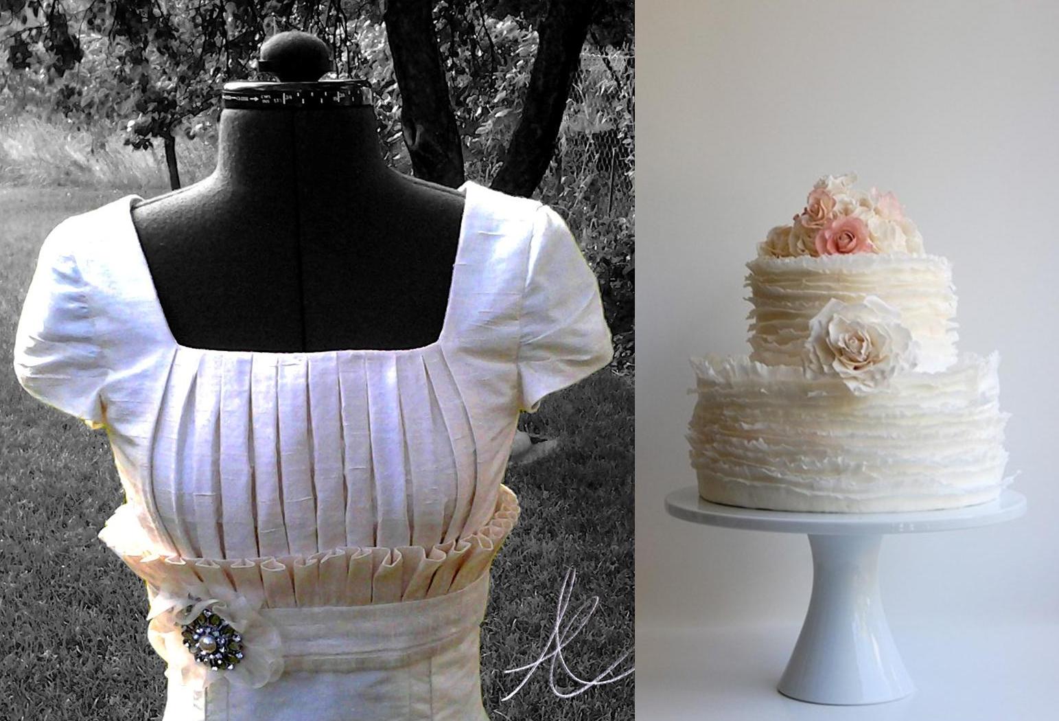
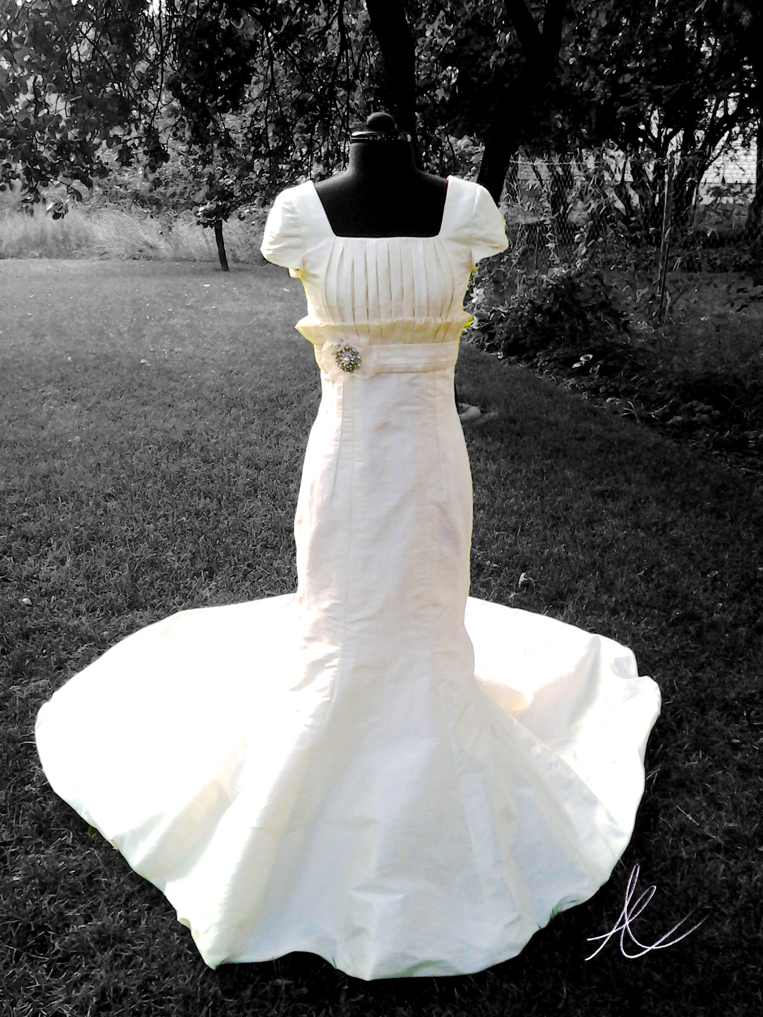
This was a 400+ hour process. Between concept drawings, creating the pattern & a mock-up dress out of muslin first to making the actual dress it is a big job. We were able to coordinate everything smoothly with her visits from Vegas for fittings which had me more that a bit nervous. Designing & making a custom dress for someone who lives nearby is one thing, but one who lives in another State is different story.

I am happy to say that she is thrilled & she looks amazing in it. It is perfect for her…made just for her. I also have a new love for ruffles…as long as they are done correctly. I affectionately call them Fruffles now.

If you follow me on Facebook, twitter or Instagram you may be so lucky as to see the bride in the dress since I plan to take pictures tomorrow night at the reception.

Image

Also I ask my  friends & sister Heather in Arizona for forgiveness from with holding photographs until now.

Inspired to create by…Blue Abalone…

17 Jun

Now typically I am not one for feeling guilty about this sort of thing but the fact that I haven’t posted since Easter is really getting under my skin. This I promise you is not due to being in a slump or any kind of designing funk. Quite the opposite really…I have been busy as usual, but just my normal sort of busy.

What this means is that I have great inspired projects in the works that I cannot wait to share with you…they just aren’t ready yet. Here is a hint, there is some art on the easel, so to speak & even some clothing design in production….a ‘Wedding Dress’ actually. I wasn’t planning to give you that much info, but if you are reading this little blog of mine here, you deserve more than just my gratitude. Thank you for reading & please stay tuned for what is coming.

One thing I must also mention is my somewhat recent gig with the online Examiner. Yes, I am writing as the Salt Lake Interior Design Examiner (my official title) & I love it. I will admit as with anything that implementing this into my life has meant some juggling at times…but it is all worth it.

So in the meantime I am pulling out a little inspiration from the archives. This one has been on my mind of late as I am seeing all the home product catalogs highlighting summer by the sea themes.

Image

These renderings are from a college assignment. We were to design a Cape Cod beach house with very specific spatial requirements. It was probably the most time consuming plan I did in college but the most enjoyable.

ImageRather than use the typical beachy color schemes or even a nautical inspiration, I chose my palette from the beautiful subtle periwinkle or blue tones that can be found in Abalone shells. There is something sort of mysterious about the sea & the pearly undersides of textural seas shells & sea creature are a lovely representation of its hidden treasures to me.

Image

I love to mix what was then (2004) considered to be more unexpected textures together…it wouldn’t be so unusual now I am sure. My fabrics were combinations of luxurious silks for pillows & drapery, with nubby linens for the bed & upholstery, natural stone counter-tops & flooring in earth tones, while the soft floor coverings & window treatments were woven organic materials. I specified lighter woods, simple contemporary lines in the furniture rather than the more traditional items you might see in a home by the sea.

ImageHere are my concepts for the design, I had to recreate the boards somewhat…I  can see a few things I would go back & change in my renderings but experience always does that. I hope you enjoy!

Inspired to create by…some hard boiled eggs…transforming them for the our Easter Celebration.

6 Apr

I could go on about how lovely Spring is & what an inspiring time of year it is to see new life, all the flowers coming up out of the ground & the blossoms on the trees. The truth is Spring has always been my favorite season, well right next to early Fall, but I woke up this morning  & it was almost 30 degrees & snow was everywhere. I was not the heavy kind, but the wet snow that sticks. It was quite a sight on all the neighbors white blossoming trees. Yes, I live in Utah where the weather is quite fickle so Spring & I are not speaking to one another right now.

It may have been the cold & the fact that I could not find my winter coat this morning as I walked, No! Ran out the door to meet with my accountant…Frankly I was not very inspired when I faced the day & was more irritable than usual…I am not a morning person by any stretch of the the imagination. Today I was sure when I woke up I was not even going to be a April 6th person, but four hours later this all changed.

Suddenly after weeks & weeks of extreme busyness trying to get ready to file my taxes & juggling my other responsibility’s I felt free! The children are on Spring break so we decided we might as well do our egg dying today. This got their cute little noses out of the books they were reading & gave us some time together.

I took one look at those white hard boiled eggs & suddenly I was feeling ambitious. We were at my mothers house so we set out the dye just the way I did as a child. We put garbage sacks on the table with layers of newspaper over the top & for the dye we put one tablespoon of vinegar in each cup with boiling water & more than a few drops of McCormick brand food coloring in each cup.

I put two layers of tape lined up next to each other about four wide, with each layer going the opposite direction to reinforce it on a piece of wax paper. I used blue painters tape on the bottom because it is easier to remove the wax paper off of than the Scotch tape which is firmer. Then I drew a design over it with a fine Micron marker & used fingernail scissors (my secret tool for cutting out fine detail & curves) to cut it out & then used the tip of an exacto knife to carefully remove the wax paper off the back. Now I had a way to transfer a design to the egg.

I put the egg  in yellow dye briefly so it would be a soft color underneath the tape. Then I let it dry completely before I applied the tape design, rubbing it softly to make sure it would not slip off. First I dipped the egg with the design in a warm green. After a bit I removed it & let it dry. Then I added a few more sticky stencils then I let it sit in the cooler almost jade green dye.

The fun thing about using the tape over the eggs is that  the dye will leak under it a bit…fairly randomly & when it does it gives the area  a sort of tie dyed look. We all got pretty creative here but I may have gone over board. Once I get an idea in my head I have to try it. That is why I have an animal print egg & a few abstract eggs to go alone with my floral designed eggs.

My children & I have  not spent this much time dying eggs in a very long while. It was nice to let our creative juices flow & just enjoy a project without feeling like we had to hurry to move on to the next thing.  For me doing this kind of casual design that is for no one but myself is a great way to recharge my battery so I can tackle the bigger more serious design stuff. It is as good for me as meditation.

If you still haven’t dyed your Easter eggs yet & are looking for a way to mix it up a bit give this a try. I would love to know how they turn out. Happy Easter for all of you Easter celebrators!

Inspired to Create by…Scot Meacham Wood

22 Mar

My first introduction to Scot Meacham Wood was through twitter. His profile  said “plotting world domination, one decorative pillow at a time” & I knew he was someone I just had to follow.

Here is a little more about Scot…borrowed from his press kit…

Scot Meacham Wood, owner of his eponymous design firm based in San Fransisco, finds absolute delight seeing his client’s homes and lives transformed over the course of each design project. “People always seem to invite me into their lives right at that particular point of personal evolution. So it is often about so much more than floor plans and custom furniture. Interior Design changes the way people live.” After working with Ralph Lauren for 15 years, Scot opened his own design business in 2001-and has since worked on residential and commercial projects of all sizes, both here in the San Francisco Bay Area as well as homes across the United States. Runner, Musician, Anglophile, Textile junkie, Science fiction nerd, and Interior Designer, Scot Meacham Wood.

As you can see, Scot is very multidimensional. Talented, dashing, debonair & charismatic….I have never even meet him in person but it isn’t hard to get a feel of what he is about by looking at his work & through our online interactions. He is the author of one of my favorite blogs Tartanscot and has an amazing portfolio just brimming with incredible work. You should take  a moment and look through it. His designs are versatile yet all are soaked in comfort and perfect bliss. I can’t think of one room I have seen of his that hasn’t made me wish I could transport myself there with a good book & a dog to lay at my feet.

His rich traditional styling is my favorite of his work, decadent at times, always eclectic & dynamic. His inspires me often in so many ways. But Scot’s love of plaid has inspired me the most. If you follow this blog you know that I believe creation is triggered and inspired by others &  the world around us, but that true creation does not include directly translating the work of another. I also believe that inspiration is part of a grand learning process in which we often have to open our eyes to things we have forgotten or even discarded and see them in a new light.

I am guilty of doing this over the years. It is important as a designer & artist  to be open-minded as well as make a practice of looking at the world through the eyes of another.

Plaid for me, up until the last year was a reminder of the mid 90’s in Utah Valley where everyone was wearing plaid flannel shirts…including myself. There was so much of it & not always in the best color combinations that I was done with it, & fast… although I have two shirts that I think on now that I wish I had saved to make throw pillows out of…

Over a year ago around Christmas Rue magazine published an article showcasing Scot’s home at Christmas time called “Plaid is the new Black.” I was entranced. First of all the showroom in Salt Lake that I frequent does not have plaids such as these…he knows where to find all the good stuff…his taste is impeccable & he marries textures as well as prints together in genius ways that will allow the plaid to be the focal point, but to also fit comfortably in the environment as if it has been there forever. Look on page 238 for the article.

There is nothing I love more than seeing a designers personal taste & style come out in their work. We are all so diverse  so it is hard not to get excited by another designers interpretation of  environment.  Since that day I have been much more comfortable with this traditional pattern as well as embraced its possibility’s…

Oh, he also has these chairs in his home in the most incredible plaid I have ever seen…to die for color story. I literally have dreams about them…

So the question is how did I take this inspiring designers work & translate into a new creation…? Well, I may have been overly ambitious. Once I get an idea in my head, that is it. I have to try it out. Here is my inspired by Scot Meacham Wood’s love of plaid, painting.

This is a technique I have been working on for a few years…I have not seen it done by anyone else, but it doesn’t mean it hasn’t been…I have not shown anyone other than those close to me the collection where I have used this technique but to represent Scot’s rich traditional style, I felt this is the direction I had to go. Everything here is acrylic paint built up in layers. The plaid is built layer by layer then filled with an acrylic resin so you can actually look into the layers of the painting. The floral itself is also layers of paint & gel mediums.

This is very time-consuming process but like I said, once I get an idea to do something…well there you go.

I hope you take the time to get to know my friend Scot a little. A true gentleman & also a very good sport for letting me do this. Thank you so much Scot.

Inspired to Create by…Saint Patty’s Day!

18 Mar

It has been a busy last few weeks for this designer. It has been such a whirlwind I am not even quite sure when I posted last. There are some big changes in the air & the biggest one that has taken much of my focus has been my new gig writing for the online examiner as the Salt Lake Interior Design Examiner…my official title. As much as they want local content, design is design…so I have made it a point to make sure my articles are informative for anyone who wants to get inside my extremely complex designers head…scared or intrigued? No really, it is not as bad as it may sound & I think it is worth checking out.

St. Patty’s Day is coming to an end & first let me just clarify why I call it this, lest you assume I just enjoy a bit of sacrilege…which I do. I am fully aware that it is called Saint Patrick’s Day but this day is even more meaningful to me than a day to dye your beverages green & wear the color of grass from head to toe. Today, March 17th is my mothers Birthday. Now don’t go asking which one because she has never confessed her age to me & since I was never the child to snoop through the house trying to find gifts & hidden secrets, I have just left it at that. If I really need to know I can find out.

Since her middle name is Patricia I often will call it Saint Patricia’s’ Day (truly she is one) but you would all be seriously confused….& sure I was disturbed (which isn’t impossible). There is also that little dilemma that my exes name is Patrick. You understand now right?

These past two days I’ve restlessly needed a break from my writing & at the spur of the I moment came up with two ideas for a couple of little paintings. I have been intrigued with the idea of using seasonal or themed paintings & art work for decorating with during the holidays. I had two little canvases that were already prepped with green textured paint that I had set aside. All of the sudden I decided, quite at the last-minute to put all my focus into them & transform them into something wonderfully lucky. Here are the results. May you all find rainbows with gold at each end & may the grass always be green on your side of the pasture. May the Luck of the Irish be with you my dears!

Image

Inspired to Create by…Pratt & Lambert’s Chinese Orange

25 Feb

No matter how much I love color or how long I have worked with it, I find that much like my relationships with others there can be a bit of an ebb & flow as to how much they are in my life at the moment. You probably know what I mean. You have friends who move away, live in another city, run away, get married, take work transfers, or even the adventuring types who won’t stay tied down to anywhere for very long…you get the idea.

Then there are the friends who you haven’t talked to since high school or college, but  one day through a phone call or a visit & your relationship is strengthened & revived. Once someone is a true friend they always are, even when life just gets in the way at times.

Well I fall in & out of love with color almost the same. It isn’t that I ever stop loving colors really, I love all colors (just like I love all my friends) it just depends on how the colors are applied or in my life at the moment.

Sometimes certain colors are less in the forefront of my thoughts than others might be. I think much of this is due to the seasonal & yearly trends as well as my clients needs & the trends of the geographic area or the demographics I’m working with.So with that being said, it can be understandable that I am often excited about  old colors that have become new again. It is much like becoming re-acquainted with a  childhood friend. Right now the colors I am renewing a relationship  with are apricots, peach’s, tangerines & corals. Four colors I hadn’t seen much of until about a year ago when they started popping up in textiles & design work everywhere. These new/old colors went from being nostalgic reminders of my youth…to being all grown up with all newer versions of themselves, that are now being cleverly used in vibrant, rich, elegant spaces. So in a way I would say as well as being reunited with some old friends, I have also made some new ones. I’ve been so inspired by these warm tones that the end of last summer 2011, I begin playing with the idea of using them in a set of stylized paintings that I had sketched out as a concept, but hadn’t yet decided what color direction to take. I started looking to various inspirations. I love the tangerines & apricots blending into cool pinks tiptoeing into the territory of the color coral such as the photo of the table setting above that I spotted on Pinterest the other day. Coral itself can be more complicated. There are coral pinks & coral reds with many tones & shades in-between. These are vibrant, sensual colors. I love them all equally & in trying to decided what direction to take, I desired to find a color to base my work off of that bridged the gap between both the pink & the red.

That is when I found Chinese Orange from Pratt & Lambert paints. Deep enough to lean towards the red direction of coral, but pink enough to be sultry & hot. The photo above shows the original texture & color blending of my canvas before the design was added, along with some inspirational photos to reflect the colors I used.I love the contrast of cool colors against warm colors because these opposites enhance one  another. I wanted the design to stand out so that was how I decided on the abstracted floral’s textural color. This raised design is a combination of textural paint mediums including  mica flakes suspended in acrylic polymer. The surface of the canvas had to be smooth to apply the top layer of pattern, so I used transparent gel acrylic which gives it depth so you can look right through it & see the dimension.

The truth is this was all very experimental on my part. I had used these various mediums a few years before for some commissioned art work & knew that I was only scraping the surface of these products potential. I wanted to do more.

The idea here was to create art work that had some flexibility…I have my logo/initials embedded subtly in the acrylic resin in such a way that you can hang these four pieces in any combination you wish & not see it unless you were up close. This set is the only one of hundreds of thumbnails with similar concepts. At some point I plan to take my designs into my own textile line.

As an interior designer, I realized I could not just create the art without envisioning the space  or color story it would belong in. I decided to give Olioboard some of my time & see what kind of concepts I could come up with. This  mood board creator program has so many possibilities. These are all merely concepts, but hopefully they will help you envision some of the possibilities of  these new paintings ‘Coral Blooms.’

Blue, turquoise, tangerine & coral tones. This color story reminds me of a cottage by the sea. It can’t take itself too seriously when vibrant corals with hints of copper & orange (a touch of tangerine tango, Pantones 2012’s color of the year) are juxtaposed against a powdery blue & vivid turquoise.I love the dynamic contrast of  monochromatic neutrals such as whites, blacks & grays with a pop of color to spice things up. If you love bright colors, but the idea of painting them all over your walls, or using them in your furniture  terrifies you, then using a neutral based palette & implementing color into your decor & a few key accent furniture pieces is a lovely compromise. I truly believe every space has the potential for showcasing the colors you love most, even if it seems they may be too dominate & daring to work with. This is where utilizing the experience & expertise of a professional designer can come in handy.

This set of paintings was intentionally created toward a more feminine direction, which depending on how they are hung will emphasis that quality more or less. I rarely get to do rooms with a more  feminine appeal with my actual clients…unless you would  consider my eleven year old daughter a client which I do, but she may not. The trademark of a more feminine feeling space is often in its use of color, although there are many other design elements that can create that more feminine feeling, such as the lines of the furnishings & accessories…I think the mood board above illustrates what I am talking about.

I love mirrored furniture for its lightness, It can be fresh, light & glamorous but it can also be used to create dynamic & dramatic contrast in a space…that is a different mood board & blog post though though. Periwinkle & I have had a bit of a strained relationship I will admit. I mentioned it in my other blog a few months back. It isn’t that I dislike this color it just is so much better company in an environment where others can feel included…such as the vivacious Chinese Orange & the subtle but charming silver.

Have a wonderful weekend everyone!

Happy Valentines!!! Inspired to Create by…Sweet Peas & Roses.

14 Feb

I hope this Valentines day finds you all well & happy! I admit I haven’t had much luck with “Val’s Day” as I like to call it.  Yes, there are quite a few stories here… I will say that my ex husband asked me to marry in on Valentines which was over fifteen years ago now & since it didn’t work out…well you get  the idea.

My best unsolicited advice is that, if you don’t have a sweetheart or if you aren’t sure the one  you have can take the pressure, then have very small expectations for the day.

The man I have been dating for the last five years + always somehow manages to get out of us celebrating this holiday at all…more stories on this subject that I don’t have energy to tell.

This year I have decided I will buy my own chocolate & if I get a kiss from him I will be grateful. I think we both suffer from Valentine angst, though no one is actually fessing up.

I am working on a set of paintings right now that has had me a bit preoccupied. I was thinking this morning how nice it would have been to have them ready to add to a post this morning but I am sleep deprived enough as it is.

Then as I was driving the children to school it hit me like a lighting bolt….I have the perfect inspired creation for this lovely Val’s day to share.

Sweet Peas & Roses…

I am well aware that I tend to come across as a contradiction to others.  My friend the astrologer David Porter says I cannot help it…something to do with the planets or stars I think…

I will tell you all day long, that roses are not my favorite flower but if you knew how many I’ve collected, planted, drawn & painted over the years you would think this was a lie.

I love orchids best though I must confess & my love of flowers in general leaves many beauty’s standing close together in the line of favorites.  There is something about roses though. The fragrance & the ease in which I could get them to grow & the romance associated with them…

I am a Libra so beauty & romance is my passion. That is the excuse Davy gave me for it anyway. I am worried at times it is really just an undiagnosed mental disorder. I have always loved to have flowers around me & in my home. A few years back I had a rose garden right outside my office window so I could open up my windows & let the breeze invite in the fragrance which I would just drink it in as I was designing.

Summer through fall I had cut roses almost every day inside the house, in nearly every room.

The rose garden outside my office in Herriman Here is a section of my rose garden from my Herriman Home. In my previous home in Clearfield I had rows of rose bushes under the windows & knew I could not be without them ever again after that. In the Clearfield home I had a country garden with two full-grown wisteria’s vines, a large peony planting, with a small sweet pea garden & a honeysuckle vine growing around ninety percent of the fences. There is nothing like vases of honeysuckle, roses & sweet peas on the window sill in the summer. I had hollyhocks also, but they are not my favorite, based off their attraction for bugs or the other way around I mean…

Roses & Sweet Peas in WhiteI am not sure when I began to develop a passion for all these frilly flowers. I was a bit of a tom boy in my youth. I used to wear combat boots with my dresses in my teens…that paints a picture for you doesn’t it? Did I mention that I am a  contraction already?

Maybe my flower lust has something to do with an art assignment I did in High school using acrylics & gesso paints. I am not sure what the criteria for the assignment was (it was that long ago) but I painted a stylized slightly abstracted painting of Roses & Sweet Peas for it. Someone bought it after that. I am not sure who. Some other school I think. I remember taking my money to buy new prismacolor pencils. Yes, that is what you do when you are a poor artist in school. I do however have a digital file so prints can be made up through imagekind if your heart so desired.

“Roses are red violets are blue”…I am going to have a great Valentines day (as long as I get my chocolate) & I hope you do too!

In all seriousness Have a lovely day full of love & happiness my friends.

Love, April Elizabeth

Inspired to Create by…the Vivacious Meredith Heron

11 Feb

Inspired to create by…the Vivacious Meredith Heron

I meet the beautiful & vivacious Meredith Heron on twitter a little over a year ago. Have you ever looked back at a time in your life & thought “okay…I guess that was a blessing in disguise?”

Well this was the case with my meeting Meredith. I had been extremely ill for a straight two months (November through December) with what seemed like everything one after the other, viruses, infections then ending in severe bronchitis…possibly walking pneumonia. I was running high fevers & delirious for much of that time & slept a lot. I could not work nor take care of my children who spent much of that time (being that it was their holiday vacation) with their dad.

When I thought was going to go lose my mind from lying around & in between bouts of delirium I would get online & try to accomplish something. The big goal was to learn twitter. I had been on twitter for some time but really had not figured out the ropes. So very different from the facebook I knew so well.

That is where  found Meredith Heron. I was following numerous designers all over the world & was watching how they interacted. It was the highlight of my day, soaking up the beauty & creativity of their work & blogs  as well as hearing what designing was like on their end of the globe.

I first spotted Meredith when she was to be a guest on twitters #DesignTV weekly Chat. Hosted by Amy Beth Cupp Dragoo & Jonathan Legate. I saw the inviting tweet & opened the link to see the picture of a Stunning Redhead, Meredith Heron who is well-known for being a regularly featured guest/host & design expert on national television programs such as Restaurant Makeover through HGTV Canada.

I was of course intrigued so I looked through her info & decided to follow her.  It was less than a week later when I was tweeting with a few folks getting my “wings wet” so to speak (still learning how to tweet back & forth) that she posted something or other about her very young adorable son & motherhood. I, feeling like an expert on the subject for some reason or other (possibly because I have been there done that ) replied to one of her tweets not expecting any kind of acknowledgement & fell off my chair when she replied…

So that is how it began. For those of you who are still twitt-errified of tweeting I am telling you that you are missing out. My world is much more interesting & colorful because I have folks like Meredith who are a part of it now.

Yes, yes! To many this online-social-media-network thing seems impersonal & much like smoke & mirrors & I wont disagree that it can be. There is always good & bad you just have to separate the two & not worry  much about what is going on behind the screen. Oh, & also know when to block someone.

Now that you know the background of how I meet Meredith  & began passively stalking her (which I’m sure I never would have been if she had not acknowledged me the way she did) you will understand why she is a constant source of inspiration to me.

She is an incredible designer & very real. I love that she speaks her mind & tells it like it is. She has more Moxie than anyone I know, which might be the red hair (I was married to a redhead but he didn’t even have close the kind of fire she possesses). I have only so much time to support & follow others. I do wish there was more of me & my time to spread out…because it is thin at times, but I do my best to support those who I know appreciate it & if I can slip some kind of support to someone who doesn’t really care, I still will.

This I can promise, will not be the first time Meredith is mentioned in this blog. Because of her genius with color (colour for those in the UK) design, & her impeccable good taste she is constantly causing the synapses to jolt in my brain with inspiration.

To me being inspired as I call it, which for me becomes a response & desire to create, is a form of receiving ideas & messages that are not a direct interpretation of the actual source of the inspiration. I am also a firm believer in giving credit where it is due. As small as it may seem if something someone does or something I see triggers a creative idea or response, I am grateful for it. Nothing is really small if it can have some impact on others.

As simple as it may seem the outfit that Meredith is wearing in the above photo during Blogfest 2011…struck me on various levels. I saw that turquoise bracelet with the deep magenta/fuchsia top & was stunned at how fabulous she looked & how beautifully she stood out in the crowd. I myself cannot pull off wearing this much color (not without the makeup of a drag queen anyway). This is the benefit of being a vivacious redhead I believe.  As much as I play with & love color I had never thought to combine the color of natural turquoise (my favorite color for the moment) with such a vibrant red violet.

It was this very photo that inspired my somewhat experimental paintings of Turquoise & Magenta-Moxie which I have listed right now on Etsy.

I used to paint/draw stylized realism, but over the past few years my artistic expression has become very loose & adventurous. This color combo was initially inspired by the outfit Meredith wore in the above picture. I added the symbolism with the animal print because to me it represents, independence, drive, boldness, tenacity…basically “Moxie” which Meredith actually helped me realize I was visually trying to define after the fact, but couldn’t put a name to.

It is difficult for me to show through photos how these really look. They are a combination of layers of acrylics & clear gel acrylic resins that create a dimension you can look into & through. I have also created them in a way that you can hang them as you please to create any form or pattern desired as shown here. My signature symbol fairly subtle for this reason.

They were created for a small space & although I have many ideas as to what color combinations they could be used in I have only had the time to throw one mood board together using a new/old favorite Olioboard. A great tool for presenting concepts that I have vowed to get back into using thanks to Leslie Carothers. I may have to add more of these ideas later since I cannot help myself & I have two other drafts in the works…

Inspired to Create by…product packaging

3 Feb

So the best made plans often seem to go a bit awry…at least for me. Just as I started this new blog I began experiencing technical difficulty’s. The simplified version is that I lost my computer & a lot of files & data…kind of a set back to say the least.

So with that being said, it wasn’t really my plan that this ‘Inspired to Create by…product packaging’ become my second post, but with February, the month of so-called romance approaching…maybe  this slightly estrogen soaked post will be appreciated.

A few years back I had a beautiful home. My dream home, then & still (being that I still dream about that home). In this home I had a lovely master bath, bedroom & dressing area.

Even though I had the privilege of designing for many clients & filling their homes with beautiful furnishings, in my own home & as a single parent my budget was fairly limited. Despite these limitations I worked to create each space to be simple & functional as well as infusing as much beauty into it as possible.

In my closet/dressing area I had beautiful eastern light in the morning to do my makeup. Which if you know me you know this is an important part of my daily ritual. The vanity area I kept fairly monochromatic so as to not compete with my colorful clothing…all in color order of course…oh & my shoes as well… This was my space. My retreat & I loved it.

I had future plans to add a center island with drawers to expand the storage space, as well as a small upholstered bench & I also had room for a folding screen…I just hadn’t found “the one” yet…this room was really not complete but it was a luxury for me just the same.

What did I say earlier? Something about the best laid plans…

Maybe if so many American’s were not experiencing this I would not even admit it, but I am part of the first wave of homeowners who lost their homes in 2009.

All of the sudden I find my children & I in a “temporary” living situation  where I am having to share a room with my nine year old daughter. I went from having a beautiful sun soaked house to being a renter & a basement dweller.

Good designers know how to work within limitations. I admit I paused on doing anything at first in our shared space, because it was supposed to be “temporary”. At least I really wanted to believe it was.  It was however our place of retreat from the outside world & I knew it needed to be emotionally fulfilling on some level. Waking up in a sparse, ugly, dimly lit room (my things were mainly in storage still)  was & is, no way to start the day.

My dilemma however was, how do I take my decor which was dominantly in shades of silver sage with a dark Mahogany bed & dresser & mix it with the vibrant decor of an almost ten year old girl? Then one day I found it. Right after the Christmas Holiday on the clearance shelf at Walgreen’s.

Bottles & tubes of lotion all decked out in a stylized floral of creams, pink, silvers & sea-foam green. Colors that were all grounded with a touch of black…making the soft pastels seem a tad more mature. This surprisingly  appealed to me, & I knew that this was going to be my starting point for creating a harmonious space for the two of us, without my having to give up the  adult decor.

I have struggled with a love hate relationship with pink over the years…but as an accent & with other colors …I can deal.  On the vanity is where our two separate areas meet as one. The pink I used there was a colder pink, with a touch of orchid.   It all became a bit more fussy than I was used to in my home, but the space needed lots of color & light. Mirrors to reflect the light were essential so I added one on top on the desk (it really is a desk from Ballard Design)  as well as one against the wall.

On my daughter’s bed I incorporated hot pink, teal, black & white pillows on a deeper silver sage green & cream print duvet…. I had a huge assortment of stuffed animals to work around.

My bedding for the most part stayed the same (no sense in buying new for a “temporary” space) with an addition of a pillow coordinating with the same tones of what was existing in my bedding with just a touch more pink.

I purchased two mirrored night stands because they reflected light & visually do not take up much space in a smaller area. I love sparkle & glamor of mirrored furniture as focal point pieces. I am against matching bedroom sets…

I never thought I would ever have pink in my room again. I thought the whole pink thing had ended when at eighteen & I covered over my pale pink walls in a forest green, gold & marbleized…very masculine wall paper. Yes! You guessed it. Late 80’s, early 90’s ish.

The truth is you never know when you will fall back in love with something you thought you were over, (like the color pink) or what little things might inspire you to go a whole new direction. Keep your eyes open. If something catches your eye, it can inspire you to create.

Inspired to Create by the Beauty’s of India…

12 Jan

This is my first official post on this new blog, other than my intro…so here goes!

A few years back I was brought into a new build project by a couple who had originally been working with another designer. The structure of the house was for the most part complete, but it was the finishing touches were what they were struggling with.

Building your new dream home is a huge endeavor.  I had assisted clients  in over 100 new builds at that point &  understood the anxiety they were experiencing to get it right & the need to know that it really was all going to come together beautifully. Both the husband & wife were brilliant Doctors from India, who were both some of the nicest clients I have ever worked with.

The need to visualize was great for them, along with a desire to make their home feel very personal & unique. They had worked hard for many years to get to the point where they could build their dream home, & when it comes to dream homes it is as much an emotional investment as it is a financial investment.

The floorplan itself was designed by Jeremy Gates of Salt City Home Designs. It was a grand entrance with a curving staircase & a large open area below which needed something….based off my other medallion designs we decided a medallion would be the perfect fit.

The home was to be furnished with an eclectic, elegant collection of the furnishings & art much of it from their  native home in India. To me it was vitality important that the medallion work harmoniously which these existing elements… So I began my research….

India had held an impression of romance for me as a young child. Part of this I believe was the story my mother had told me many times of the Taj Mahal. One year for Halloween I remember my mother painting my face brown, spraying my hair black & painting a red dot on my forehead, then wrapping me in a Sari & sending me off to the school parade. It was the itchiest costume I had ever worn, but I felt fascinating & exotic regardless….plus no one even recognized me not even my teacher. It was a good costume.

In my research I was inspired by the delicate, detailed ornamentation of the Indian culture.  From a brides henna tattooed hands  to the intricate  lacy fretwork or repetitive shapes in the architecture….to patterns of embroidered medallions on silk sari’s or embellished metals & gems.  I wanted my design to be reminiscent of these influences.

I came up with three different designs options for the medallion.  After the client selected the one they wanted, I then rendered  options for placement & for the sake of visualizing the colors of the materials & also as important  so they could decide on the direction & placement. Which I used to have an approximately 12′ diameter stone water-jet cut medallion fabricated.

Here is the finished result….

This design is owned & copyrighted by myself, April Elizabeth of A E Design. Any reproduction of use must be approved personally by me. Thank you.

%d bloggers like this: