No matter how much I love color or how long I have worked with it, I find that much like my relationships with others there can be a bit of an ebb & flow as to how much they are in my life at the moment. You probably know what I mean. You have friends who move away, live in another city, run away, get married, take work transfers, or even the adventuring types who won’t stay tied down to anywhere for very long…you get the idea.
Then there are the friends who you haven’t talked to since high school or college, but one day through a phone call or a visit & your relationship is strengthened & revived. Once someone is a true friend they always are, even when life just gets in the way at times.
Well I fall in & out of love with color almost the same. It isn’t that I ever stop loving colors really, I love all colors (just like I love all my friends) it just depends on how the colors are applied or in my life at the moment.
Sometimes certain colors are less in the forefront of my thoughts than others might be. I think much of this is due to the seasonal & yearly trends as well as my clients needs & the trends of the geographic area or the demographics I’m working with. So with that being said, it can be understandable that I am often excited about old colors that have become new again. It is much like becoming re-acquainted with a childhood friend. Right now the colors I am renewing a relationship with are apricots, peach’s, tangerines & corals. Four colors I hadn’t seen much of until about a year ago when they started popping up in textiles & design work everywhere. These new/old colors went from being nostalgic reminders of my youth…to being all grown up with all newer versions of themselves, that are now being cleverly used in vibrant, rich, elegant spaces. So in a way I would say as well as being reunited with some old friends, I have also made some new ones.
  I’ve been so inspired by these warm tones that the end of last summer 2011, I begin playing with the idea of using them in a set of stylized paintings that I had sketched out as a concept, but hadn’t yet decided what color direction to take. I started looking to various inspirations. I love the tangerines & apricots blending into cool pinks tiptoeing into the territory of the color coral such as the photo of the table setting above that I spotted on Pinterest the other day. Coral itself can be more complicated. There are coral pinks & coral reds with many tones & shades in-between. These are vibrant, sensual colors. I love them all equally & in trying to decided what direction to take, I desired to find a color to base my work off of that bridged the gap between both the pink & the red.
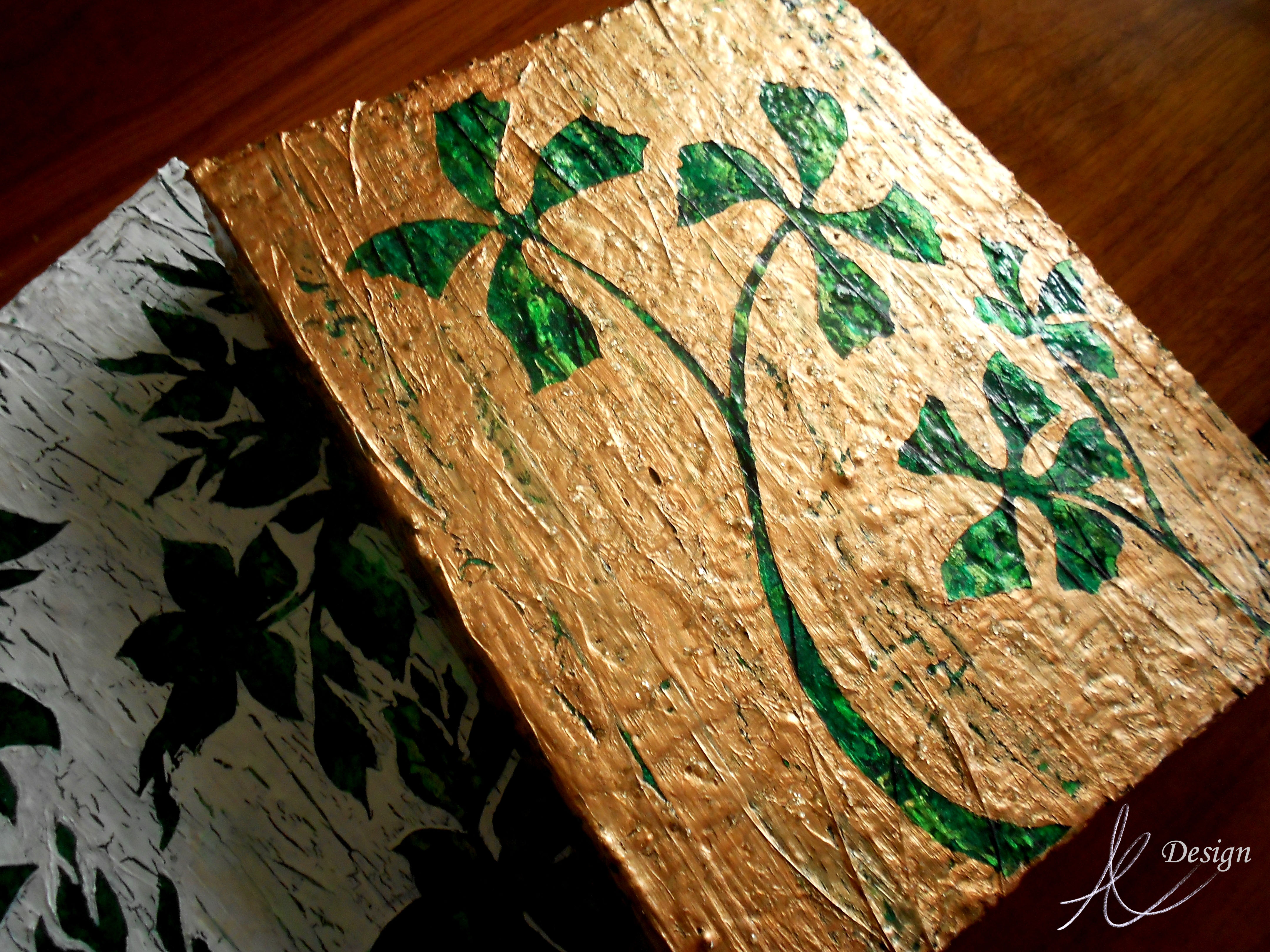
That is when I found Chinese Orange from Pratt & Lambert paints. Deep enough to lean towards the red direction of coral, but pink enough to be sultry & hot. The photo above shows the original texture & color blending of my canvas before the design was added, along with some inspirational photos to reflect the colors I used. I love the contrast of cool colors against warm colors because these opposites enhance one another. I wanted the design to stand out so that was how I decided on the abstracted floral’s textural color. This raised design is a combination of textural paint mediums including mica flakes suspended in acrylic polymer. The surface of the canvas had to be smooth to apply the top layer of pattern, so I used transparent gel acrylic which gives it depth so you can look right through it & see the dimension.
The truth is this was all very experimental on my part. I had used these various mediums a few years before for some commissioned art work & knew that I was only scraping the surface of these products potential. I wanted to do more.
 The idea here was to create art work that had some flexibility…I have my logo/initials embedded subtly in the acrylic resin in such a way that you can hang these four pieces in any combination you wish & not see it unless you were up close. This set is the only one of hundreds of thumbnails with similar concepts. At some point I plan to take my designs into my own textile line.
As an interior designer, I realized I could not just create the art without envisioning the space or color story it would belong in. I decided to give Olioboard some of my time & see what kind of concepts I could come up with. This mood board creator program has so many possibilities. These are all merely concepts, but hopefully they will help you envision some of the possibilities of these new paintings ‘Coral Blooms.’

Blue, turquoise, tangerine & coral tones. This color story reminds me of a cottage by the sea. It can’t take itself too seriously when vibrant corals with hints of copper & orange (a touch of tangerine tango, Pantones 2012’s color of the year) are juxtaposed against a powdery blue & vivid turquoise. I love the dynamic contrast of monochromatic neutrals such as whites, blacks & grays with a pop of color to spice things up. If you love bright colors, but the idea of painting them all over your walls, or using them in your furniture terrifies you, then using a neutral based palette & implementing color into your decor & a few key accent furniture pieces is a lovely compromise. I truly believe every space has the potential for showcasing the colors you love most, even if it seems they may be too dominate & daring to work with. This is where utilizing the experience & expertise of a professional designer can come in handy.
 This set of paintings was intentionally created toward a more feminine direction, which depending on how they are hung will emphasis that quality more or less. I rarely get to do rooms with a more feminine appeal with my actual clients…unless you would consider my eleven year old daughter a client which I do, but she may not. The trademark of a more feminine feeling space is often in its use of color, although there are many other design elements that can create that more feminine feeling, such as the lines of the furnishings & accessories…I think the mood board above illustrates what I am talking about.
I love mirrored furniture for its lightness, It can be fresh, light & glamorous but it can also be used to create dynamic & dramatic contrast in a space…that is a different mood board & blog post though though. Periwinkle & I have had a bit of a strained relationship I will admit. I mentioned it in my other blog a few months back. It isn’t that I dislike this color it just is so much better company in an environment where others can feel included…such as the vivacious Chinese Orange & the subtle but charming silver.
Have a wonderful weekend everyone!
Tags: april elizabeth, art, Chinese Orange, Coral, design, elegant spaces, interior design, interior designer, Olioboard, Painting, Periwinkle, Pinterest, Pratt & Lambert, Tangerine Tango, warm tones